Looking Glass
Experiential marketing specialists
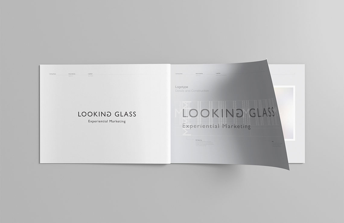
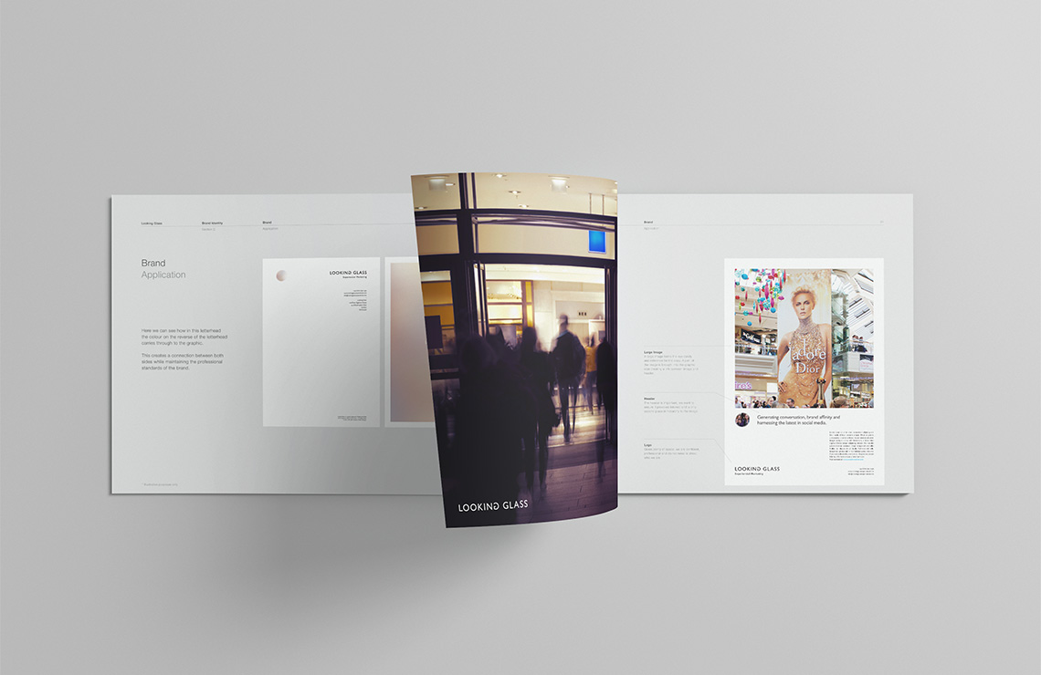
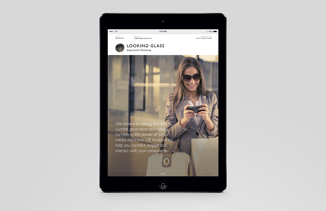
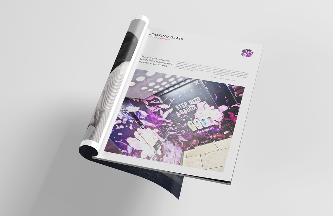
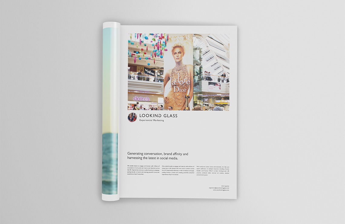
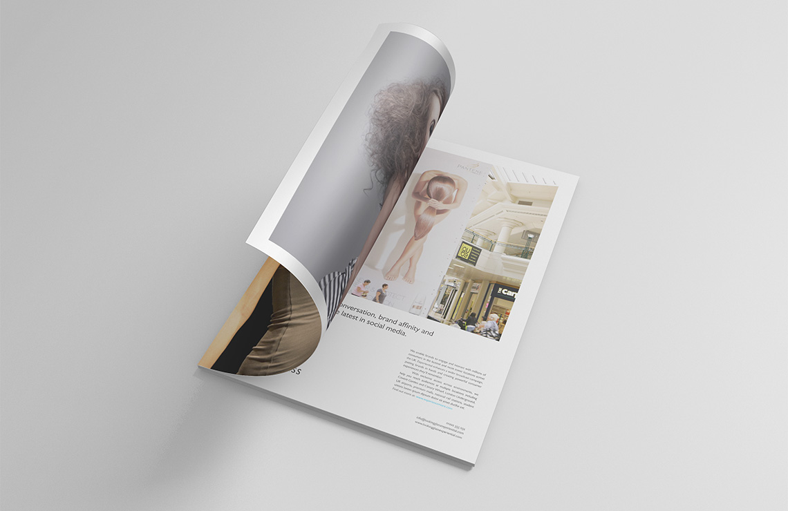
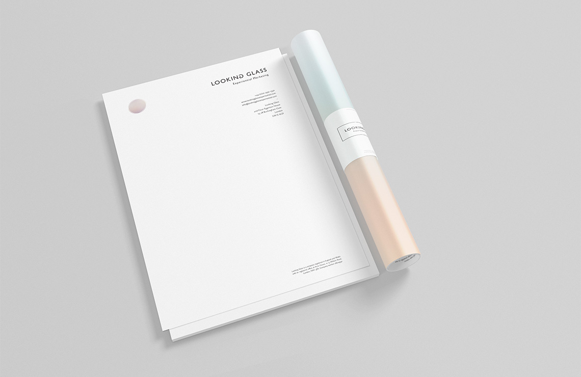
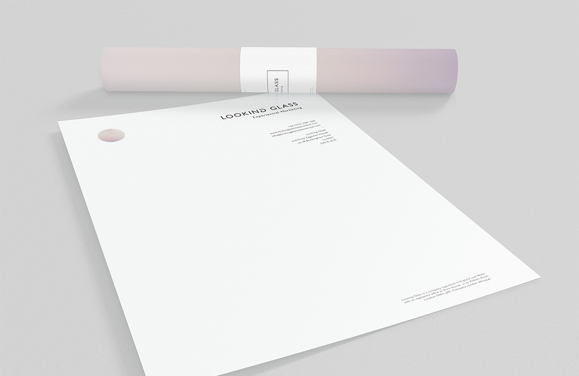
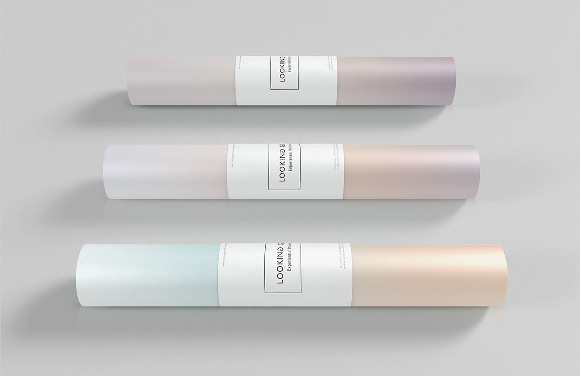
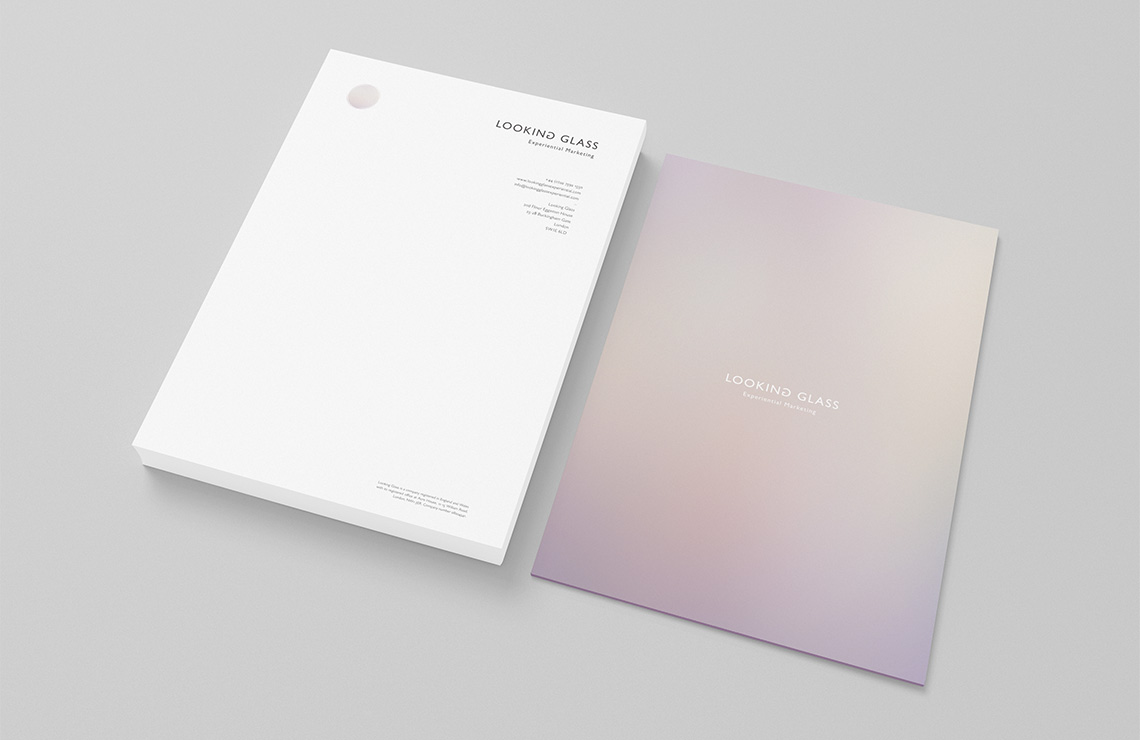
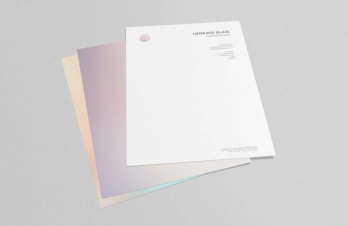
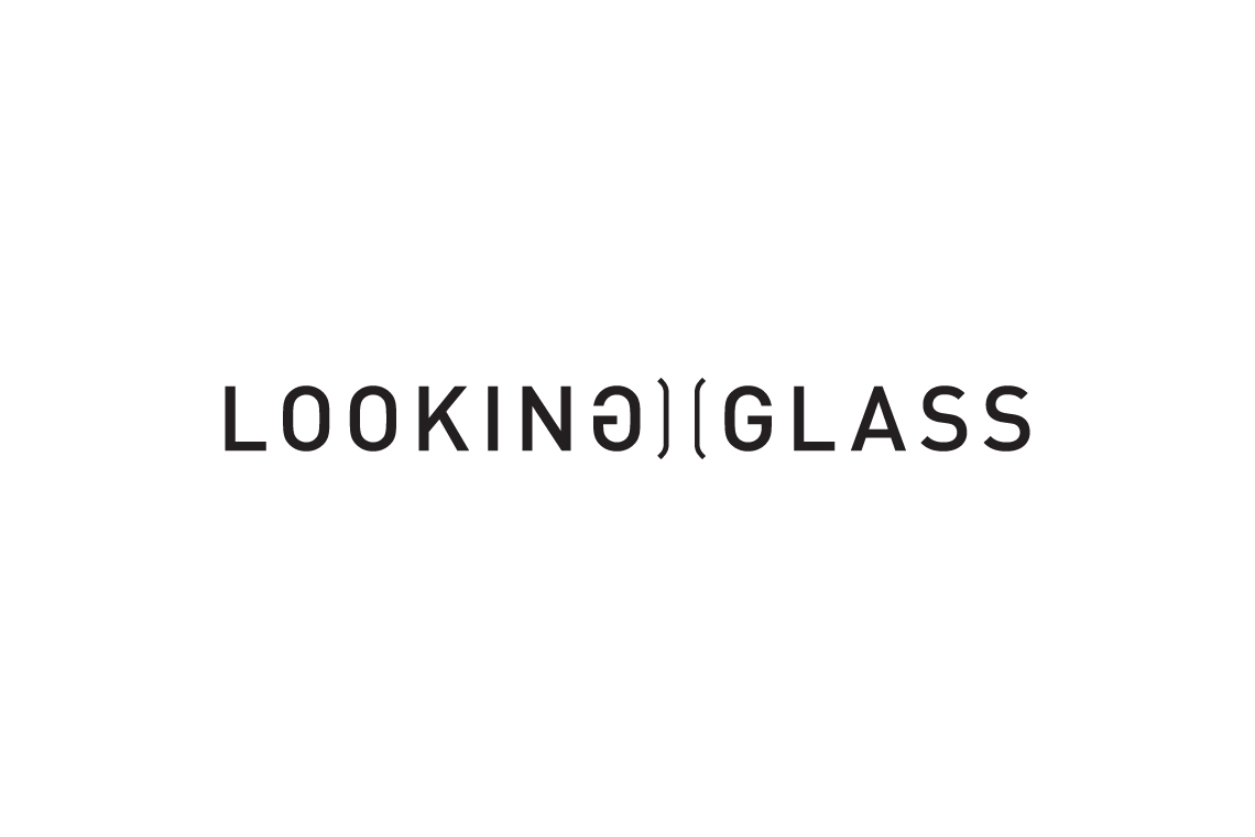
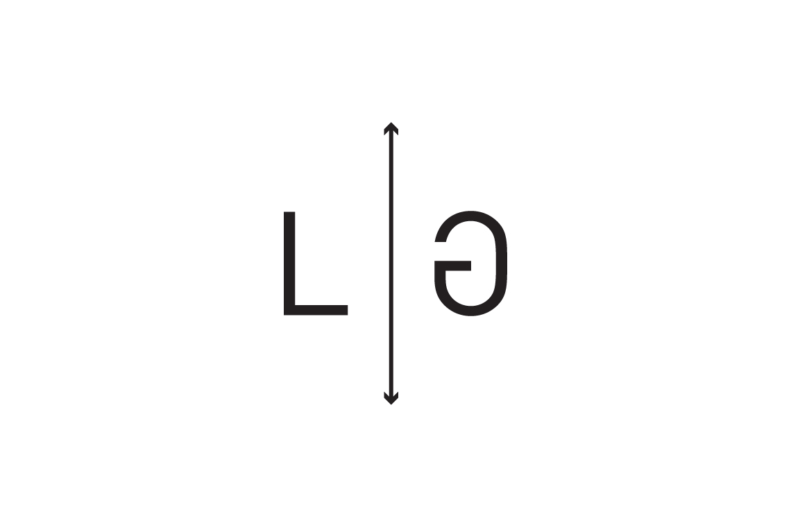
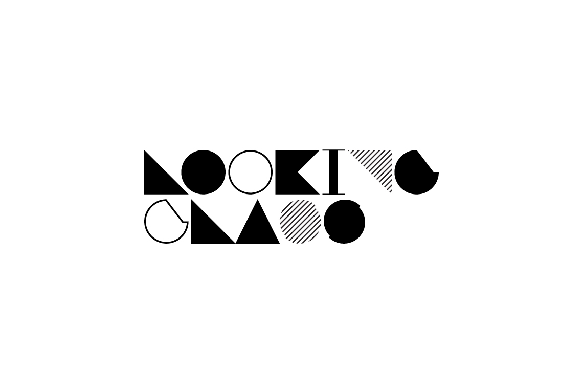
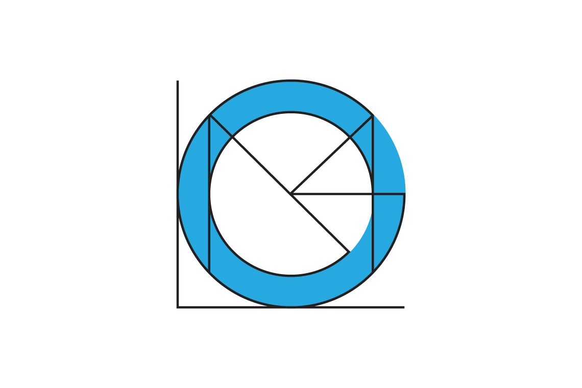
The re-imagining of an experiential marketing company. Named for a loose tie to the maddening adventures of a certain Alice. The reflected ‘G’ in Looking is a nod towards the opposite motif found in the respective story.
Operating exclusively within the the UK. Beautifully geometric, Gill Sans is an obvious choice being the Helvetica of the UK mainland. With a subtle tip of the hat towards the typeface used on classic Penguin covers.
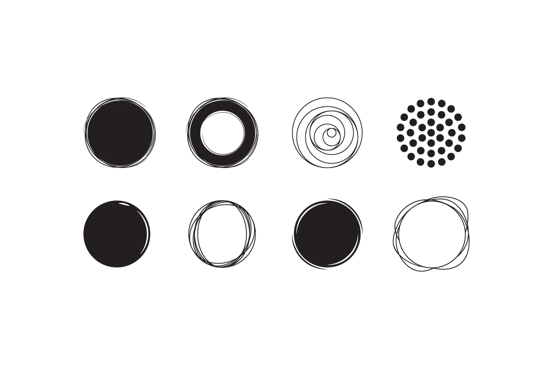
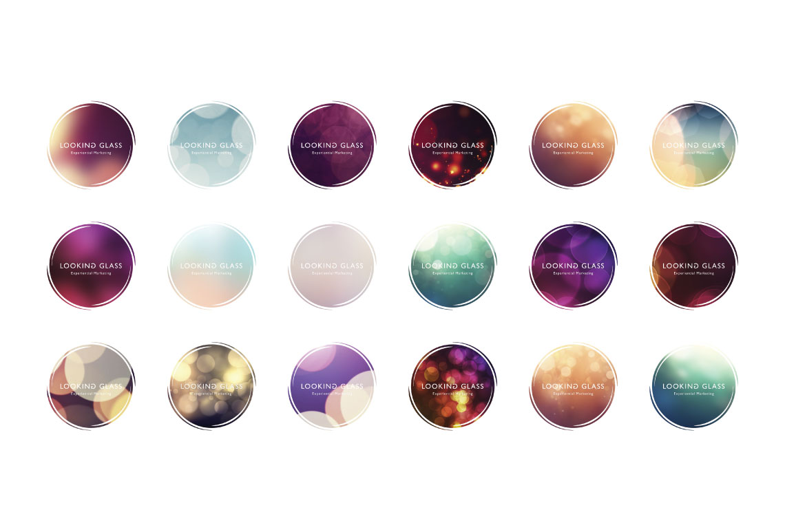
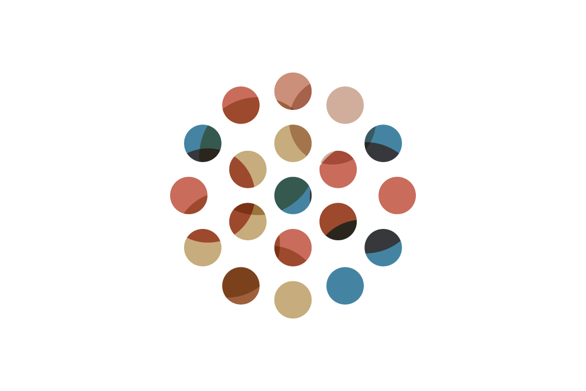
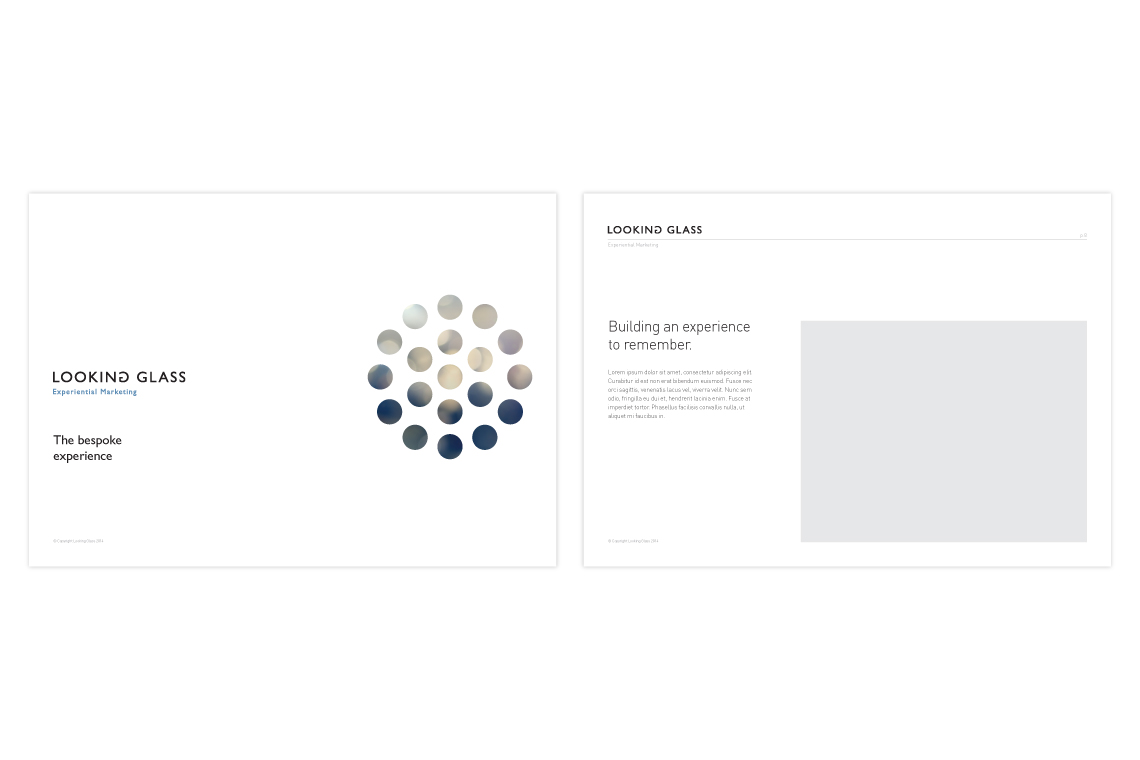
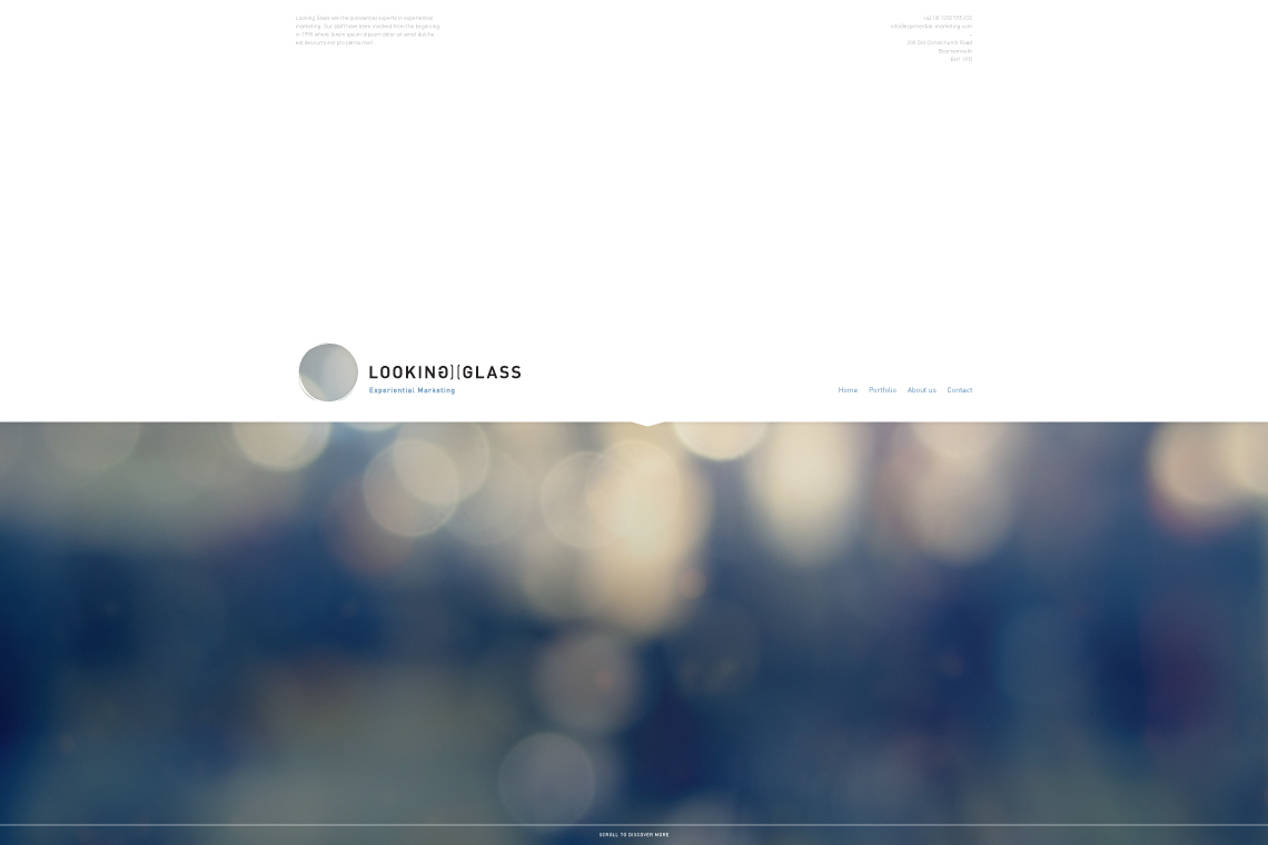
The graphic icon concept was built around the idea of a cut out. What sat within this window would constantly change, either borrowing from an image in an advert, website or simply a kaleidoscope of colour.
From the sketchbook:
Made in Scotland
Bred in Wales, educated in Cornwall and working in England. Living among the cafés, coffee shops and clichés of Christchurch. Plumen light bulbs dangle in pendants above the dining room table, Bertoia diamond chairs are draped in fur throws and a rosewood Eames lounger is home to an owl shaped cushion with button eyes. I’ve operated under the guise of a designer since 2008, dabbling in the ink, pixels and vectors of brand and building between the parentheses of web development.
For those of you who prefer picture books and colouring outside the lines.
Download Something Sensible [PDF]
For the more discerning connoisseur who can spell connoisseur without a google search.