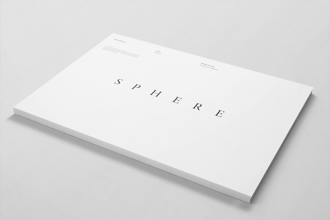
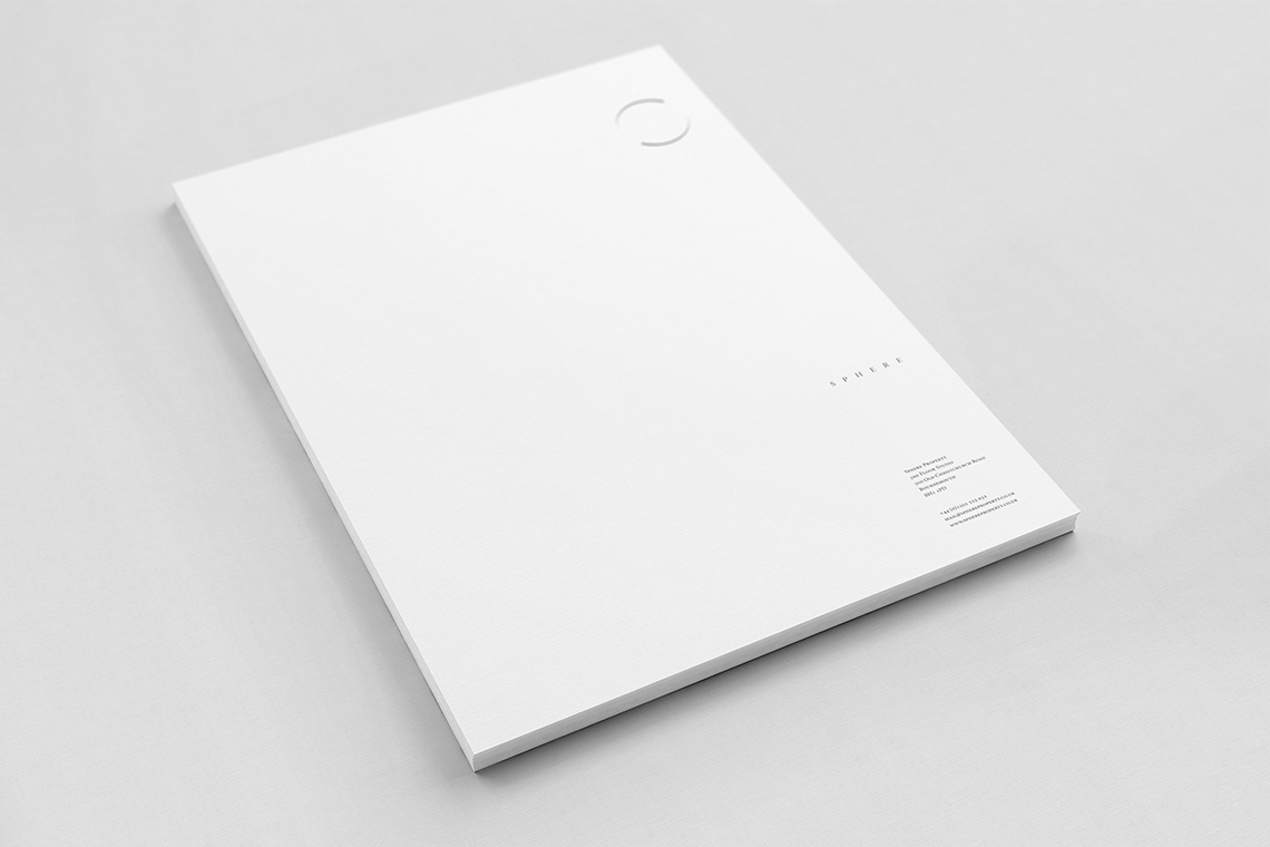
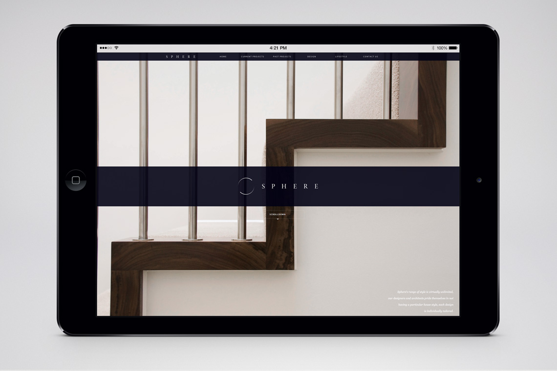
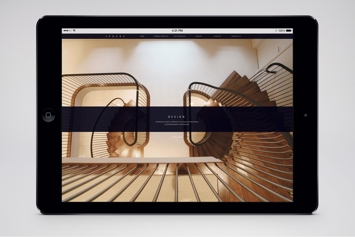
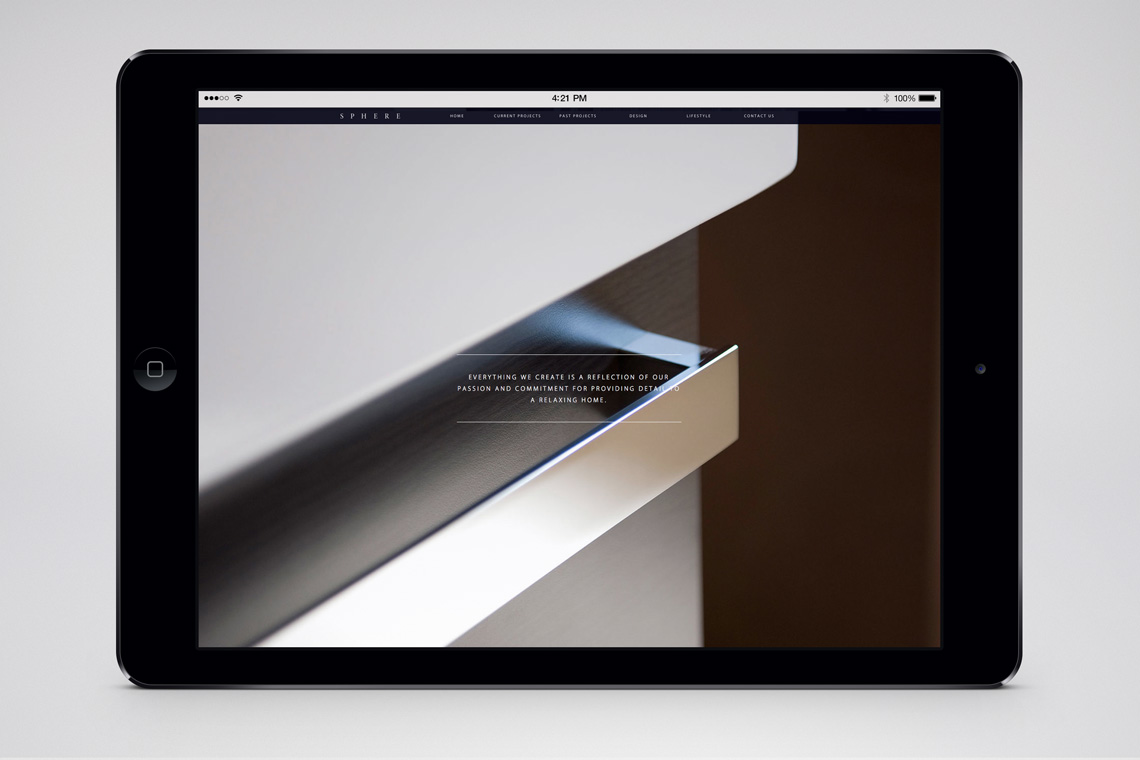
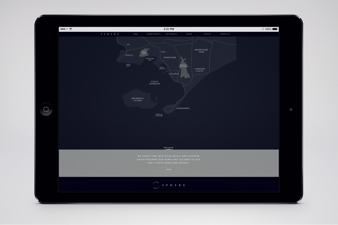
Sphere
South-west England Property Developers
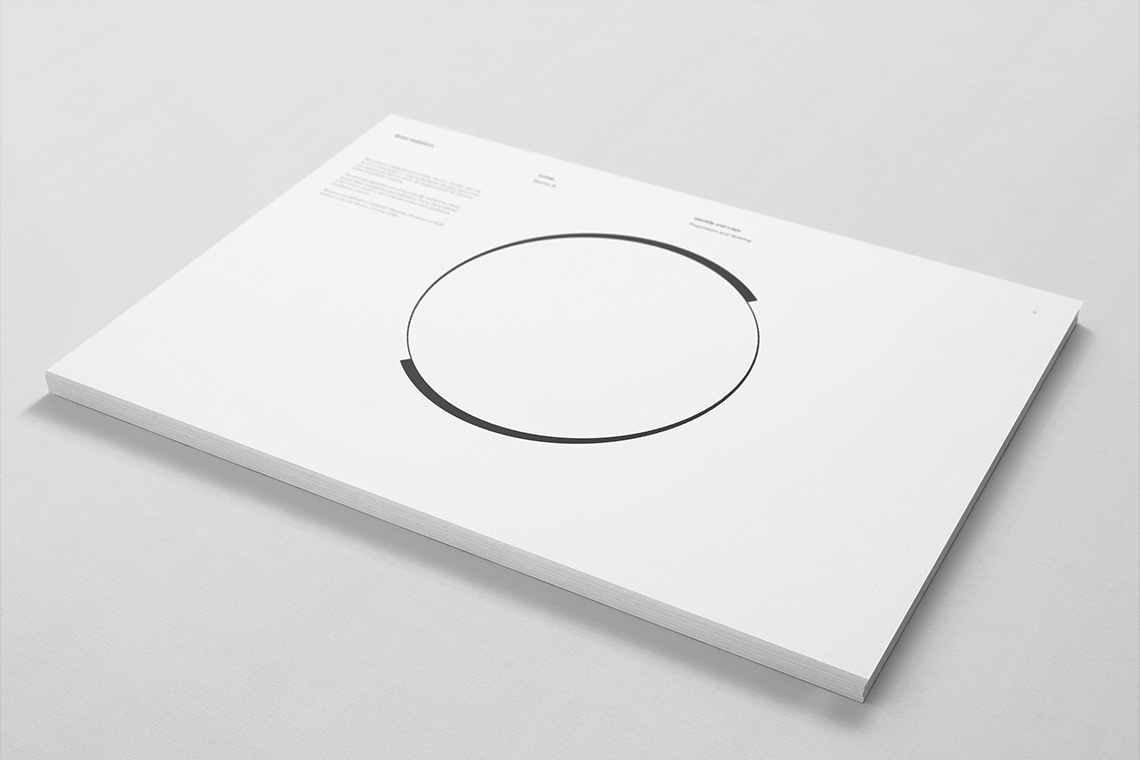
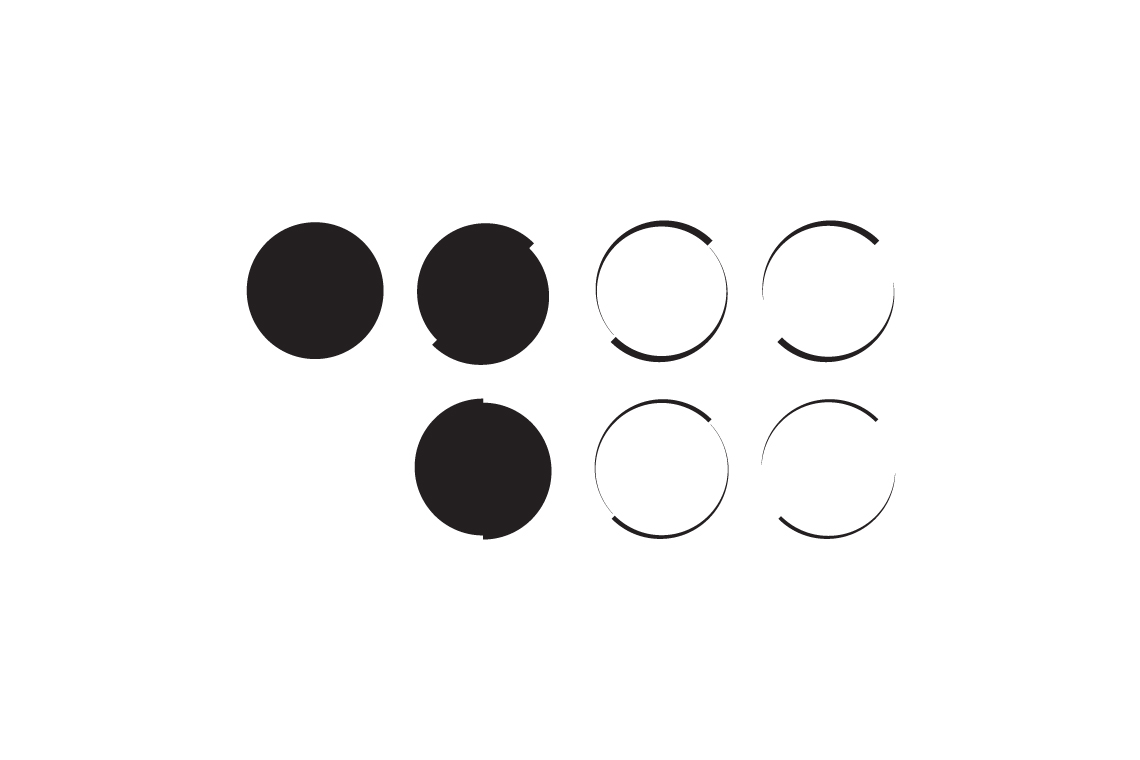
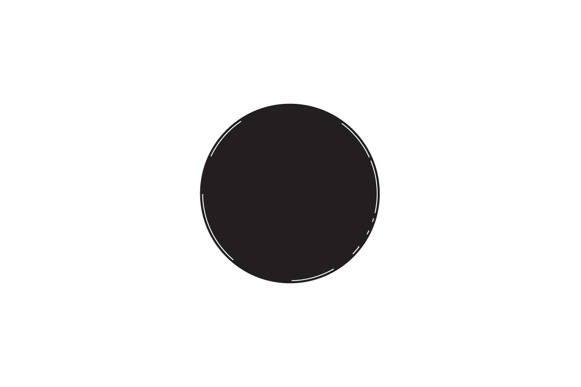
The brief began with a request for a red circle, but shiny. Entering into the premium end of housing development, we suggested giving us a little bit of time to explore a few alternatives. The resulting identity was unanimously approved and taken on board.
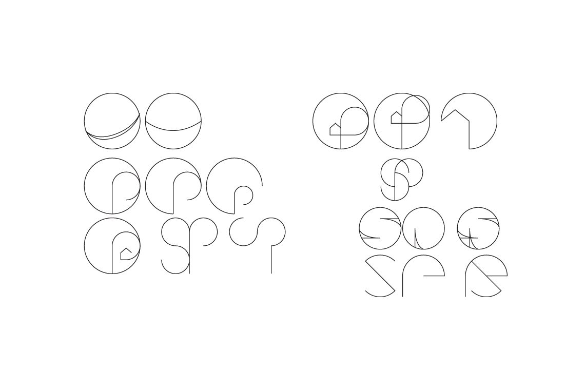
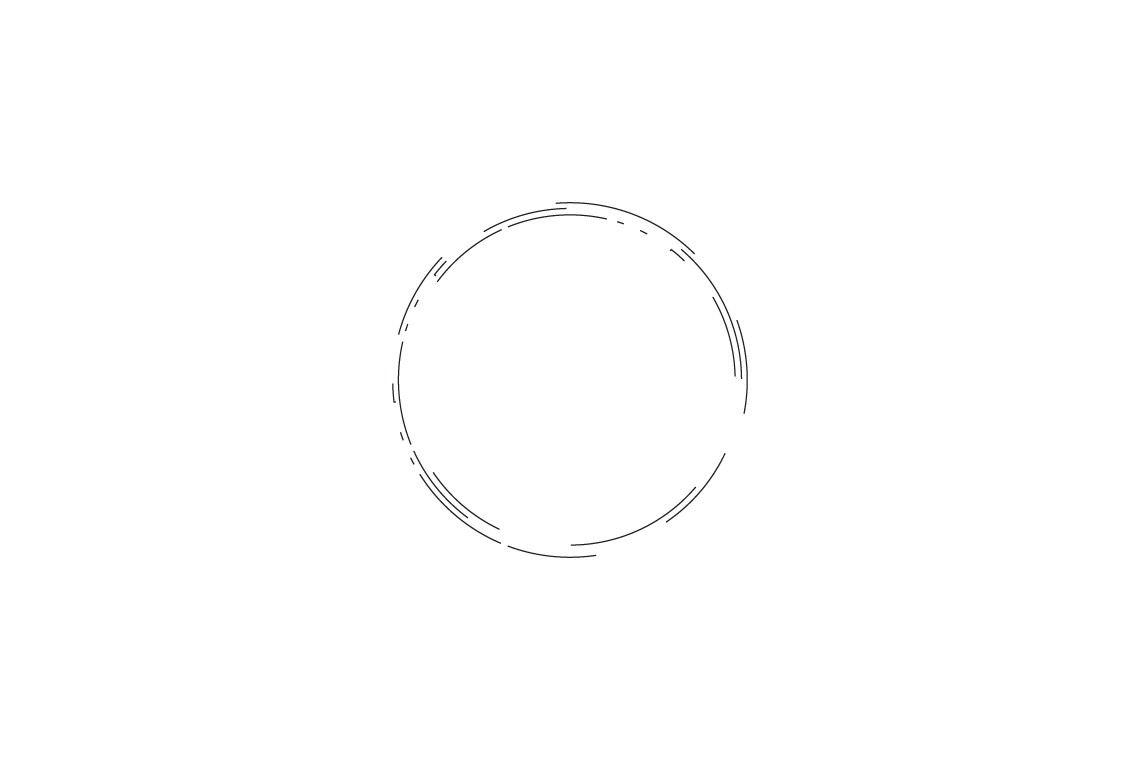
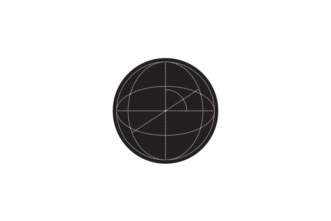
The graphic for sphere was actually born from the geometric representation of a letter S. Much of the play with the idea was concentrating on creating the illusion of a sphere, looking at methods of creating movement and light without gradients or shadows.
From the sketchbook:
I love working with geometry, there’s a beauty to it’s symmetry and rational construction. Something which syncs very well with the like minded methods of a designer who admires alignment and proportion.

Made in Scotland
Bred in Wales, educated in Cornwall and working in England. Living among the cafés, coffee shops and clichés of Christchurch. Plumen light bulbs dangle in pendants above the dining room table, Bertoia diamond chairs are draped in fur throws and a rosewood Eames lounger is home to an owl shaped cushion with button eyes. I’ve operated under the guise of a designer since 2008, dabbling in the ink, pixels and vectors of brand and building between the parentheses of web development.
For those of you who prefer picture books and colouring outside the lines.
Download Something Sensible [PDF]
For the more discerning connoisseur who can spell connoisseur without a google search.
