Hafzoo
Characterful Identity of Austrian Film Director Andreas Hafele
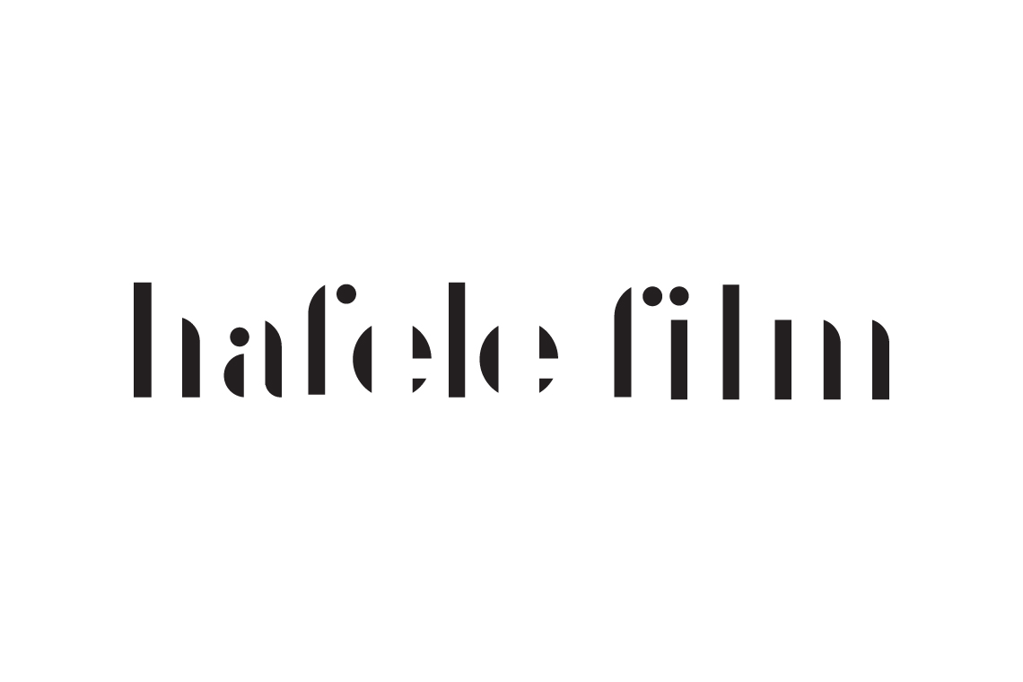
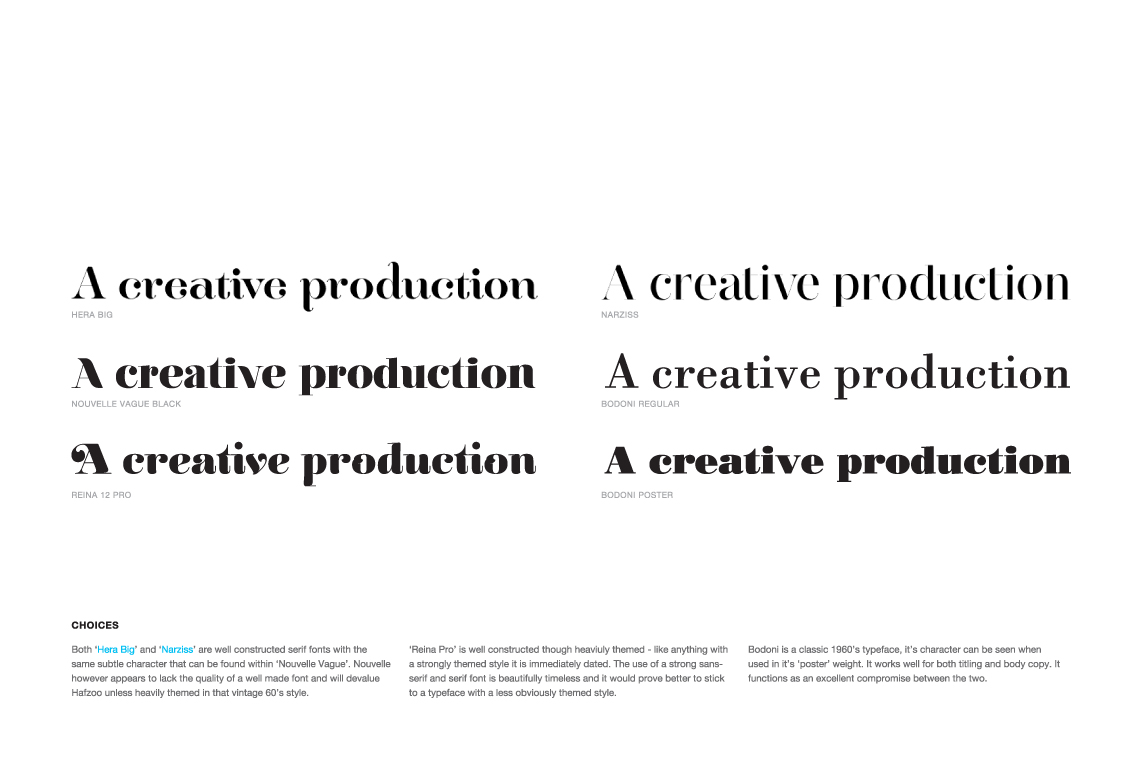
Andreas is one of those wonderful clients who share’s an interest in the design world. In creating his identity there was much discussion on typefaces and after countless fonts and weights, it was in an almost exhausted sigh as we reluctantly agreed Helvetica just worked.
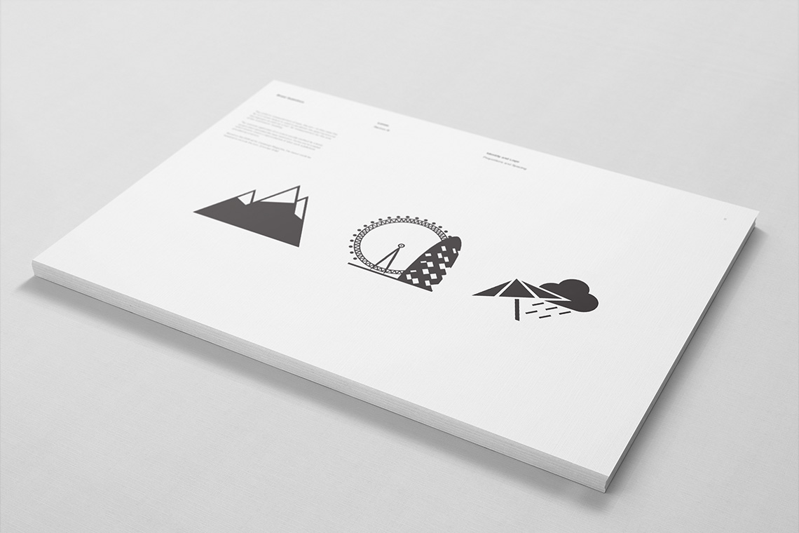
We wanted it to be a subtle tweak, uncomplicated and crafted. An individual twist to the letter-forms let them marry next to each other like a three letter ligature. With a weakness for iconography, I crafted Andreas a few for the contact section of his site we designed.

From the sketchbook:
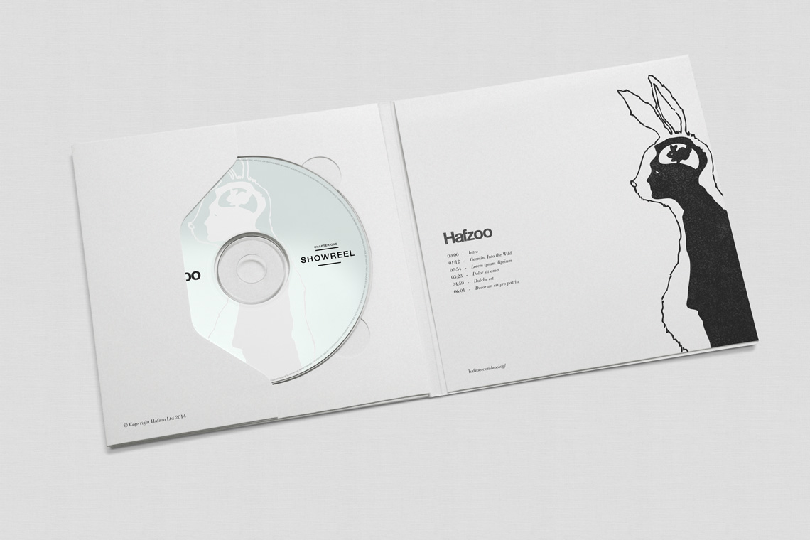
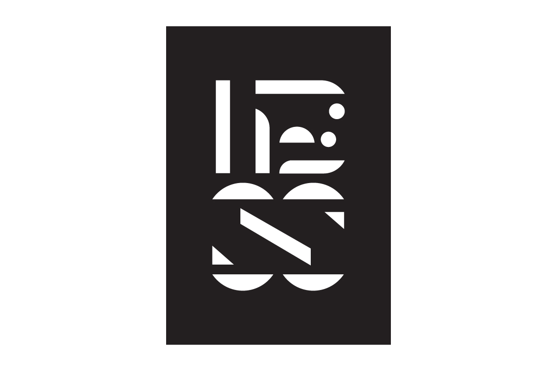
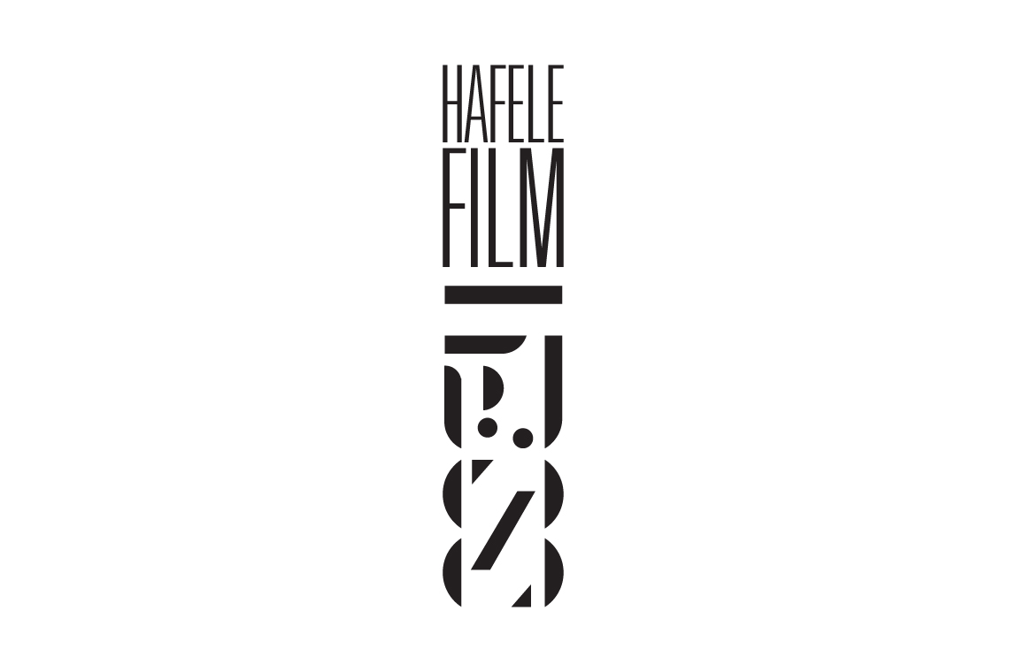
During the concept stage there was one design I had a soft spot for. Custom-made the letter-forms created some really interesting patterns, forms and possibilities.
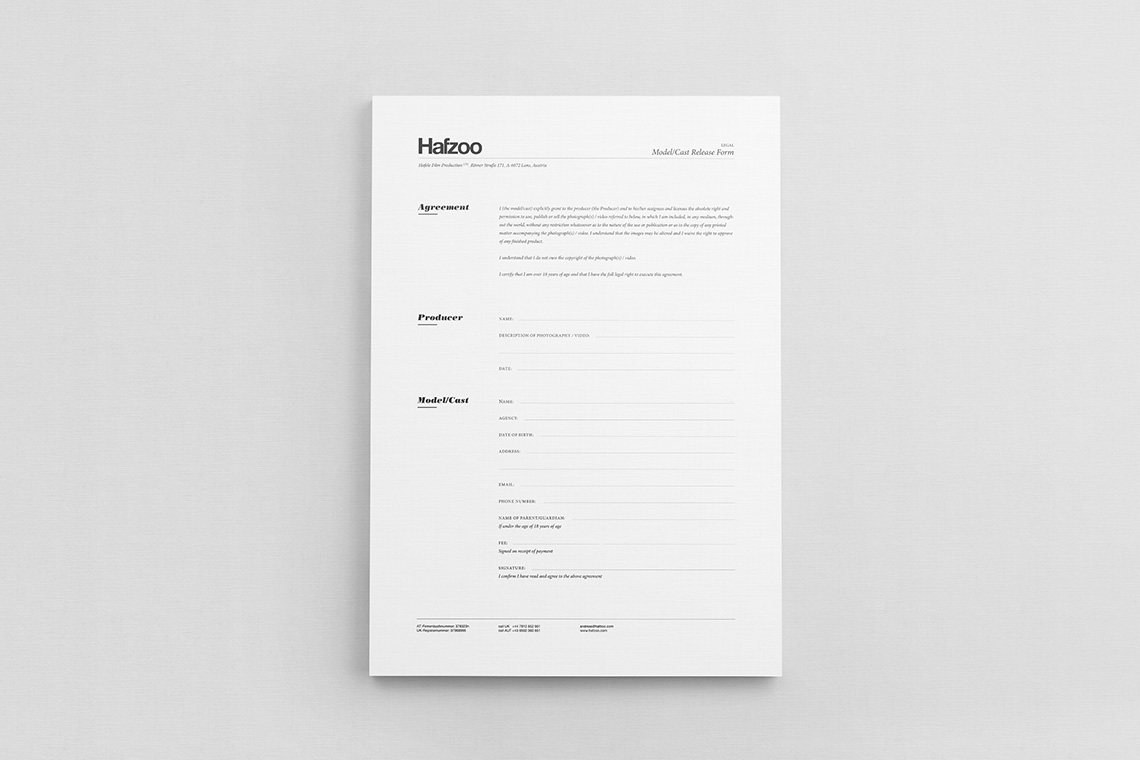
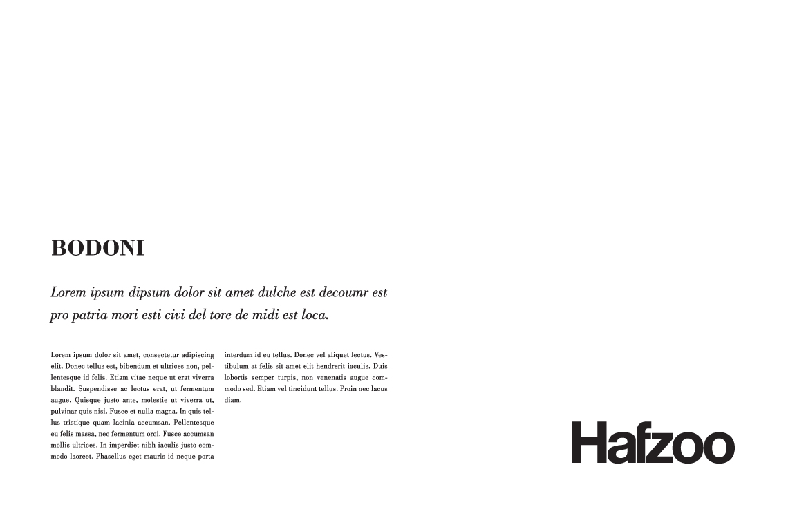
Bodoni was the selected secondary typeface, primarily to be used for titling and content. This contrasted nicely with the sensibilities of the Helvetica logotype.
Made in Scotland
Bred in Wales, educated in Cornwall and working in England. Living among the cafés, coffee shops and clichés of Christchurch. Plumen light bulbs dangle in pendants above the dining room table, Bertoia diamond chairs are draped in fur throws and a rosewood Eames lounger is home to an owl shaped cushion with button eyes. I’ve operated under the guise of a designer since 2008, dabbling in the ink, pixels and vectors of brand and building between the parentheses of web development.
For those of you who prefer picture books and colouring outside the lines.
Download Something Sensible [PDF]
For the more discerning connoisseur who can spell connoisseur without a google search.
