Silver Arrow
Sandbanks and South-west Property Developer
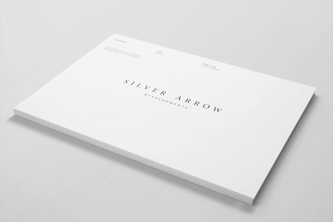
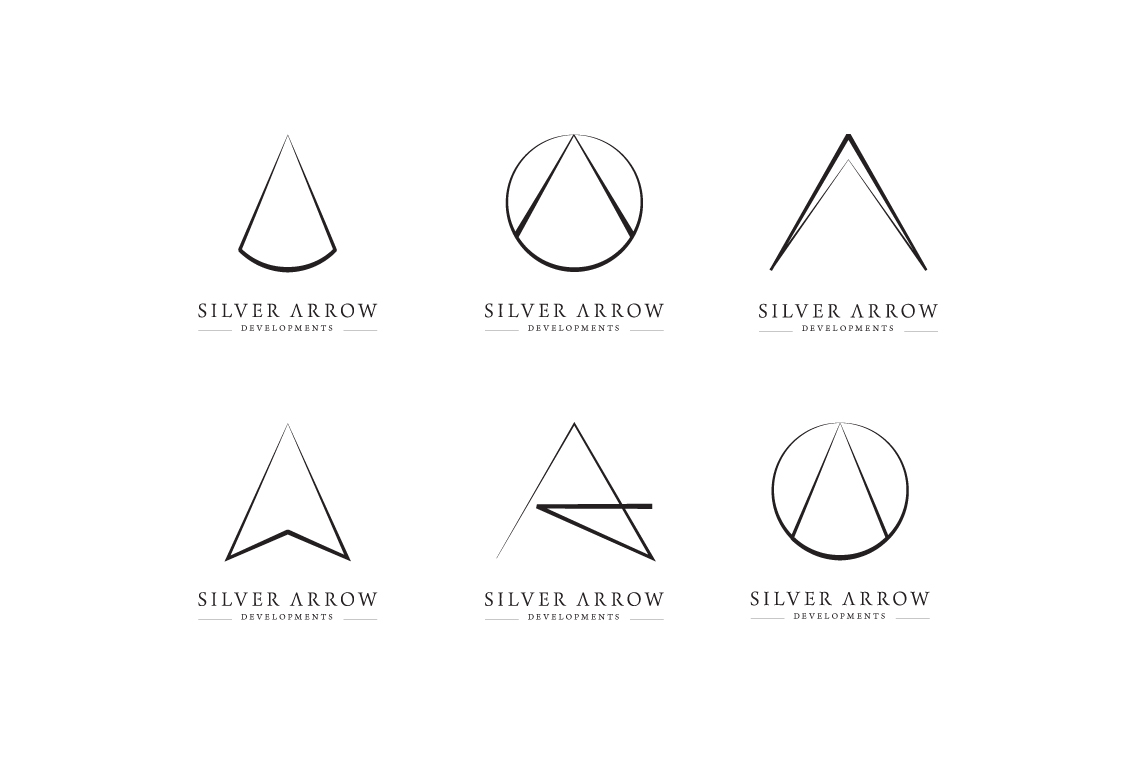
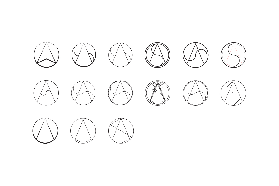
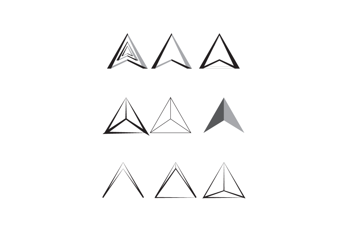
With such an evident visual cue to a name, the exploration for Silver Arrow’s identity became an exercise in dodging the obvious and cliché and looking for the alternative representation of the names qualities.
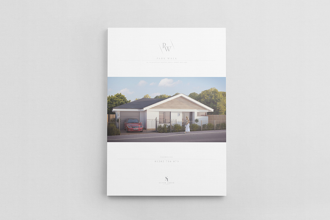
Silver Arrow was one of the first identities I was tasked with creating under a different Creative Director and it presented an interesting lesson in learning the personal taste of both the client and creative director.
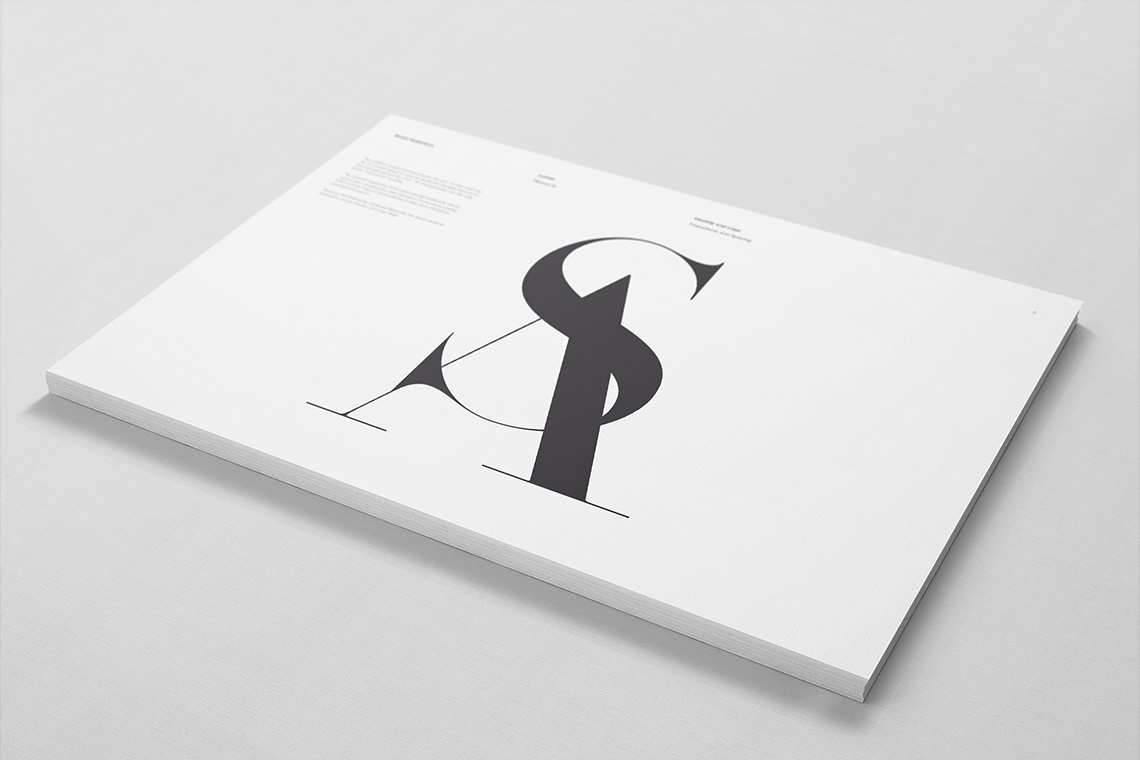
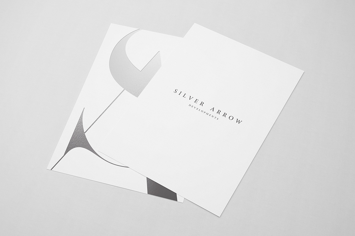
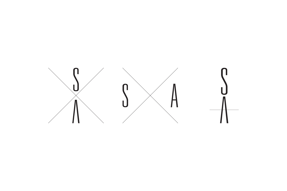
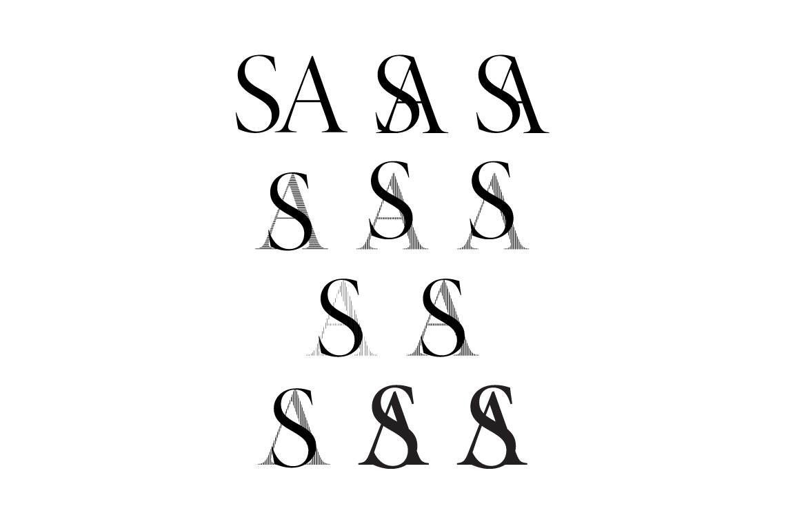
Created from the beautifully contrasting letter forms of Hoefler & Frere-Jones rework of Didot. The uppercase A created an arrow like form, which the S elegantly wrapped itself around forming the cross bar.
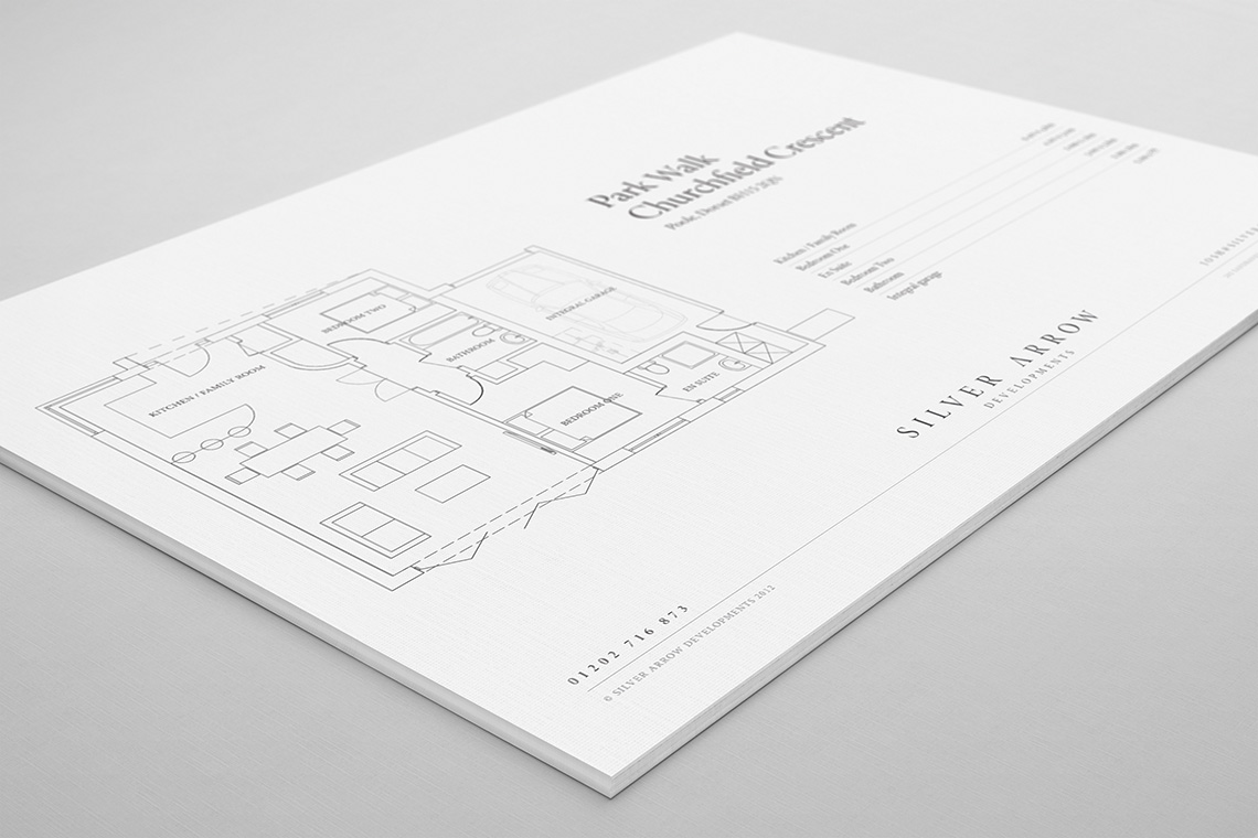
From the sketchbook:
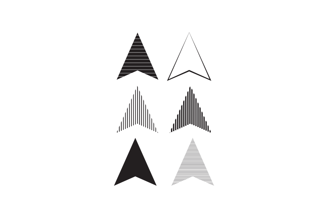
Here we can see a few more clichéd examples of a Silver Arrow. It’s an interesting note to design, that sometimes we have to explore the obvious so we can move beyond it to something more original.
Playing with the idea of light to mimic silver like qualities primarily involved a look at a contrast in weight - shifting from thin to thick elements. It was this which eventually led to the decision to use Didot.
Made in Scotland
Bred in Wales, educated in Cornwall and working in England. Living among the cafés, coffee shops and clichés of Christchurch. Plumen light bulbs dangle in pendants above the dining room table, Bertoia diamond chairs are draped in fur throws and a rosewood Eames lounger is home to an owl shaped cushion with button eyes. I’ve operated under the guise of a designer since 2008, dabbling in the ink, pixels and vectors of brand and building between the parentheses of web development.
For those of you who prefer picture books and colouring outside the lines.
Download Something Sensible [PDF]
For the more discerning connoisseur who can spell connoisseur without a google search.