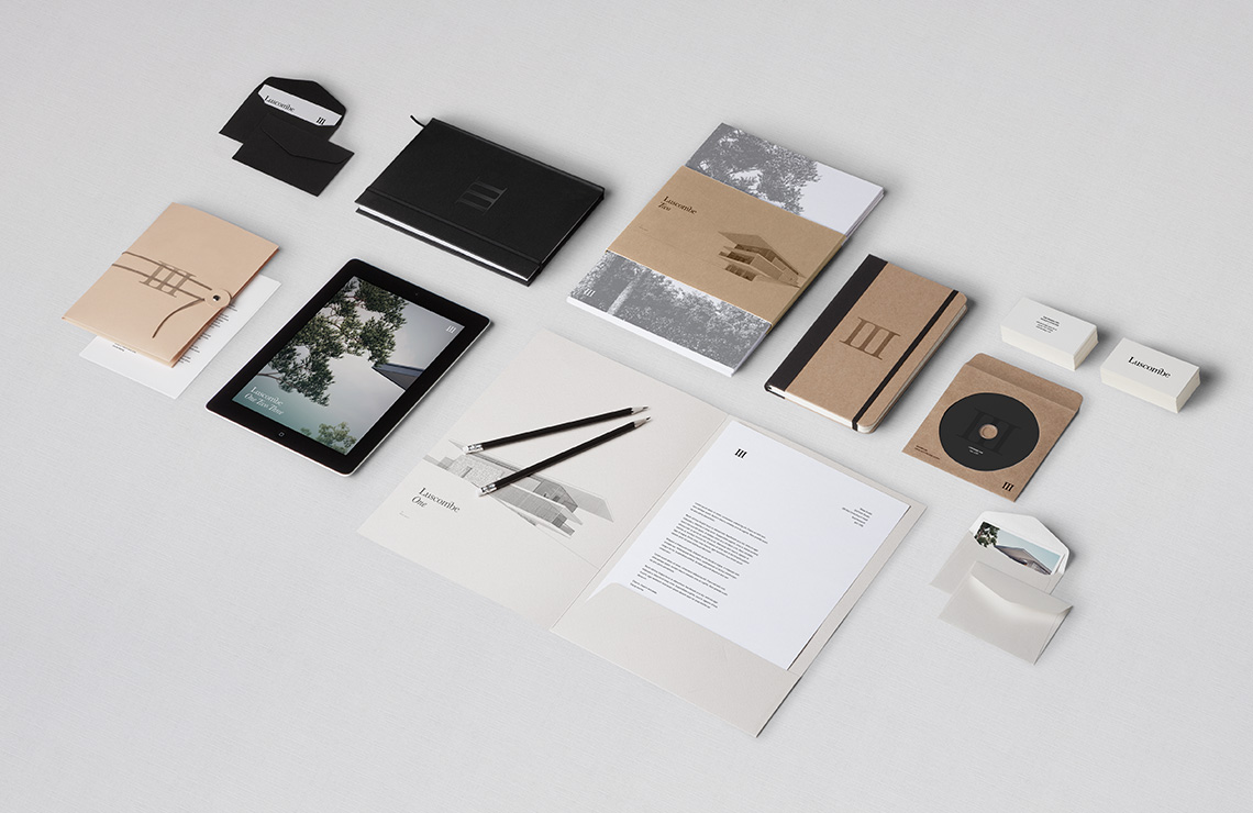
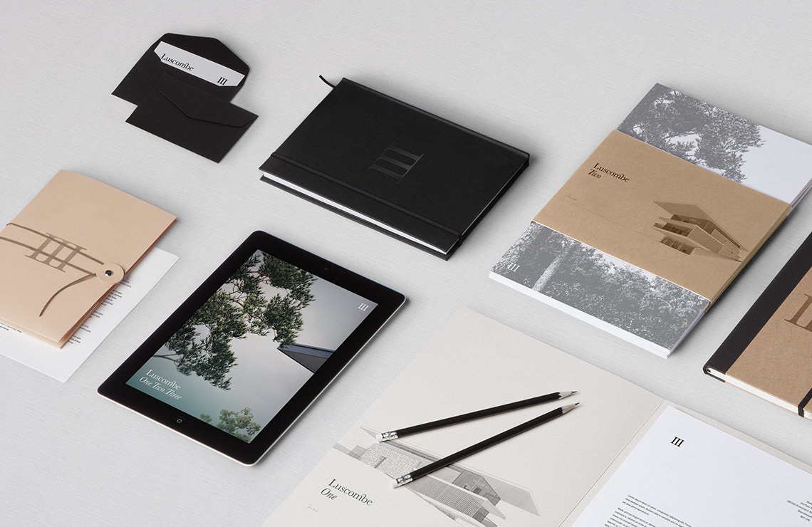
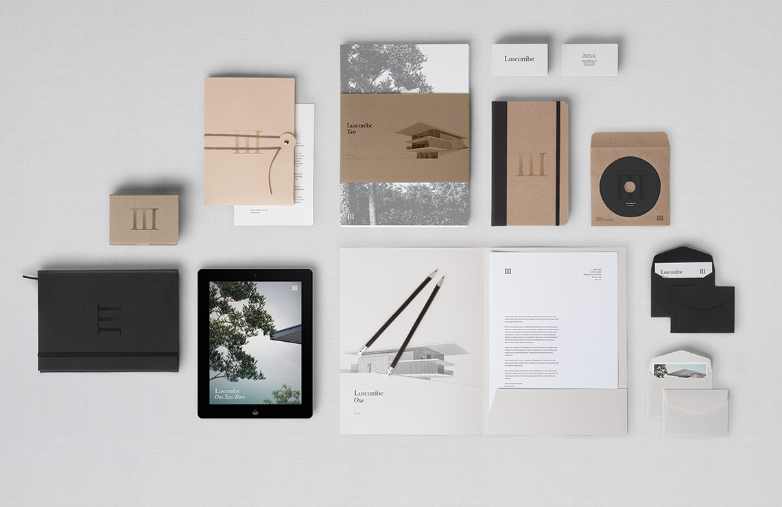
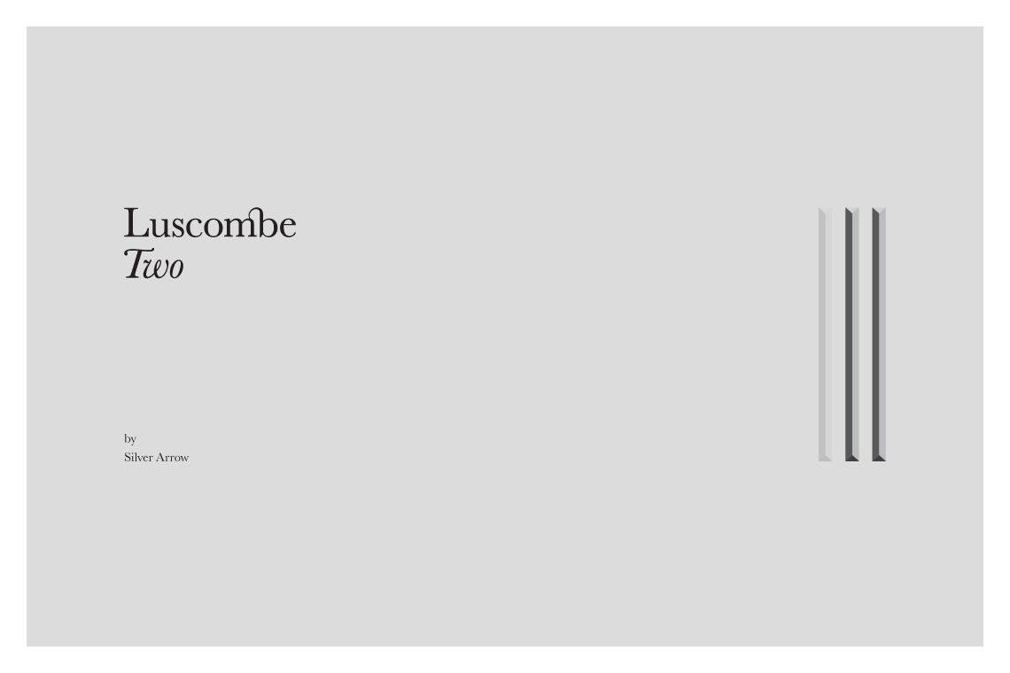
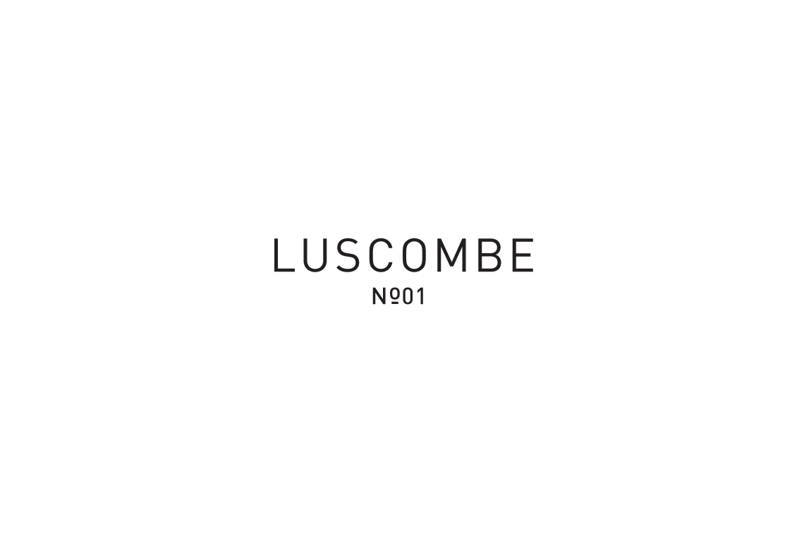
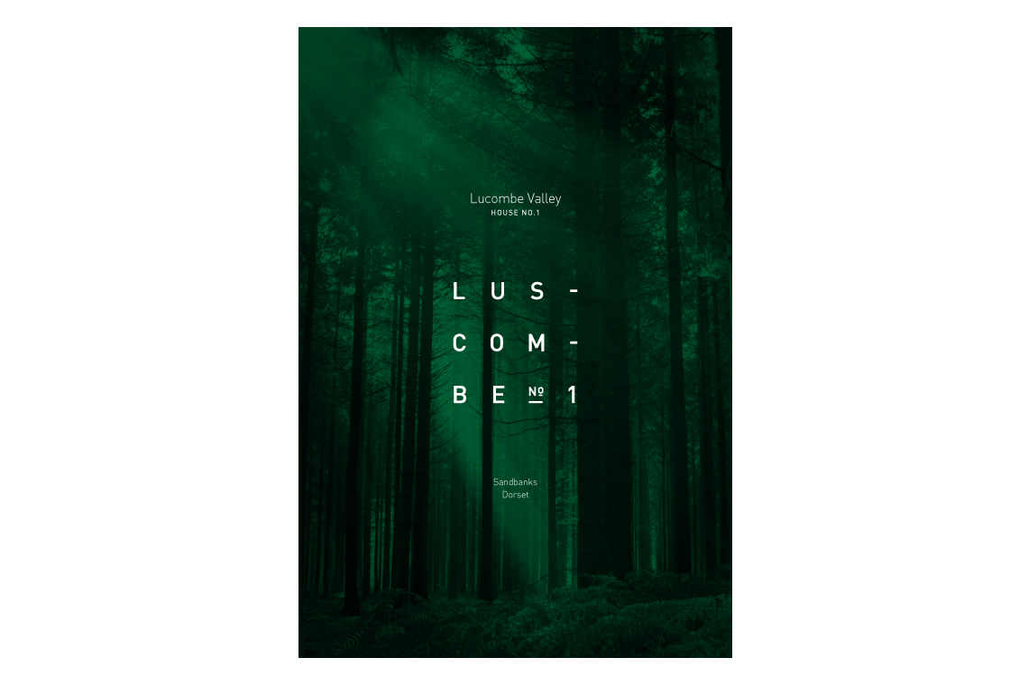
Luscombe
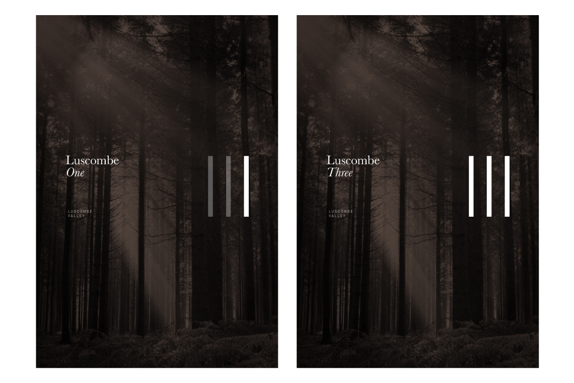
Three Highly Exclusive Property Developments in Sandbanks
“I’m going to make a long speech because I didn’t have time to write a short one.” - Churchill. Luscombe was one of my favorite identities, not because it’s so simple but because it took it’s time to reach something so pure.
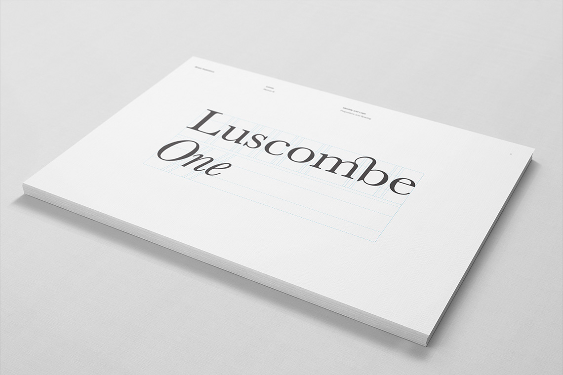
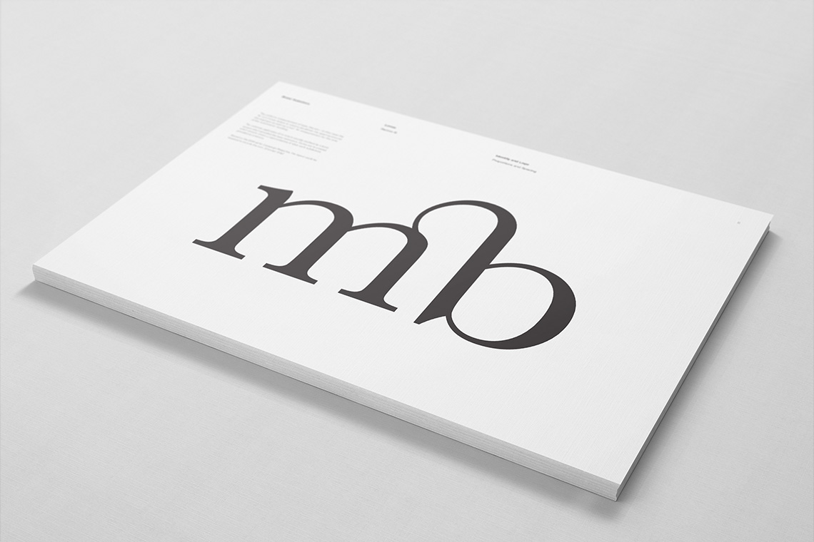
The goal was to create something luxuriously understated in it’s sophistication. Baskerville has a beautiful high contrast to it’s letter-forms while remaining stunningly classic with it’s British origin and genuine italic.
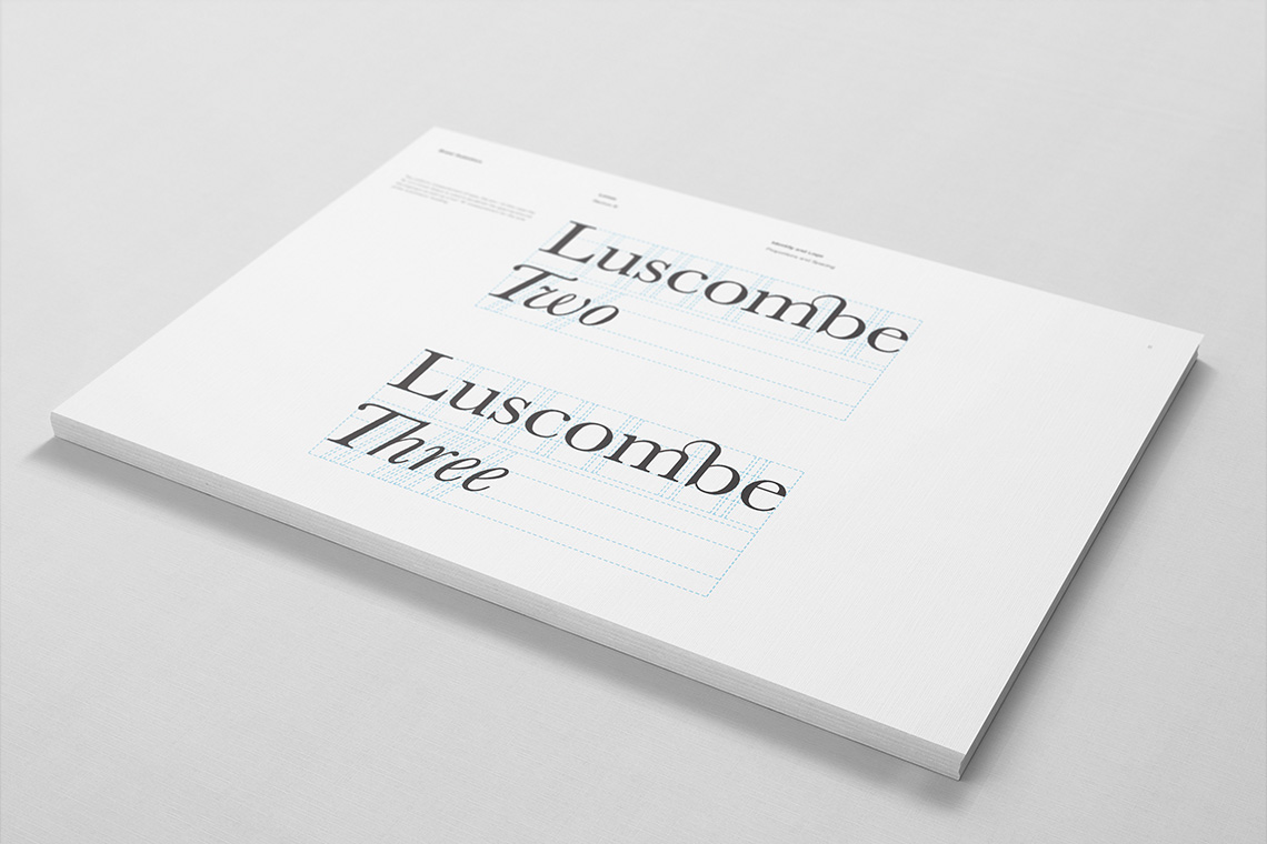
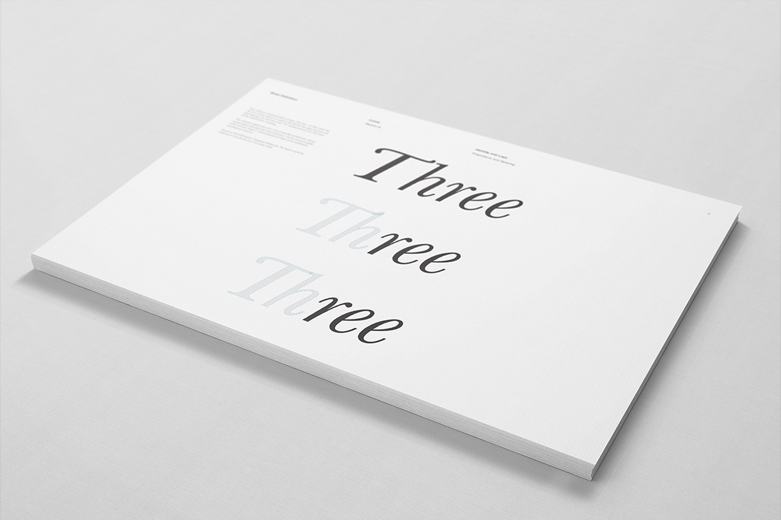
To add a little touch of designer pretentiousness, I created my own discretionary ligature within the Luscombe logotype and arrogantly created a new ligature between the uppercase ’T’ and lowercase ‘h’ of “Three”.
From the sketchbook:
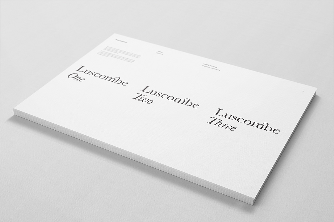
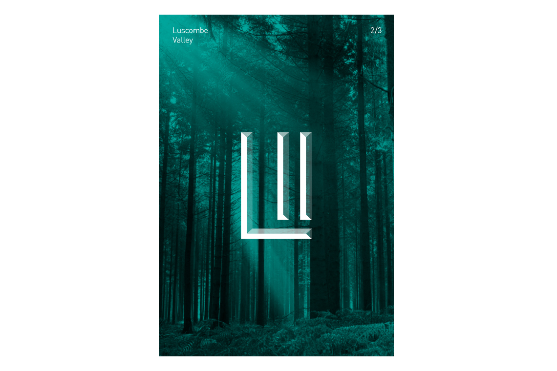
When creating a piece of design you're looking for those identifying marks, those curious elements to play with, highlight, distort and provoke. Luscombe had three properties under it's name, with something so simple it's nice to see how much could be developed from it.
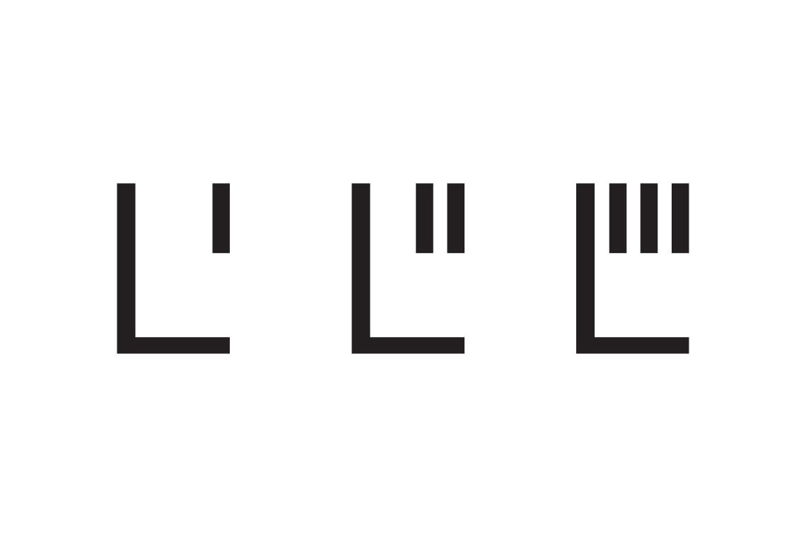
Made in Scotland
Bred in Wales, educated in Cornwall and working in England. Living among the cafés, coffee shops and clichés of Christchurch. Plumen light bulbs dangle in pendants above the dining room table, Bertoia diamond chairs are draped in fur throws and a rosewood Eames lounger is home to an owl shaped cushion with button eyes. I’ve operated under the guise of a designer since 2008, dabbling in the ink, pixels and vectors of brand and building between the parentheses of web development.
For those of you who prefer picture books and colouring outside the lines.
Download Something Sensible [PDF]
For the more discerning connoisseur who can spell connoisseur without a google search.
