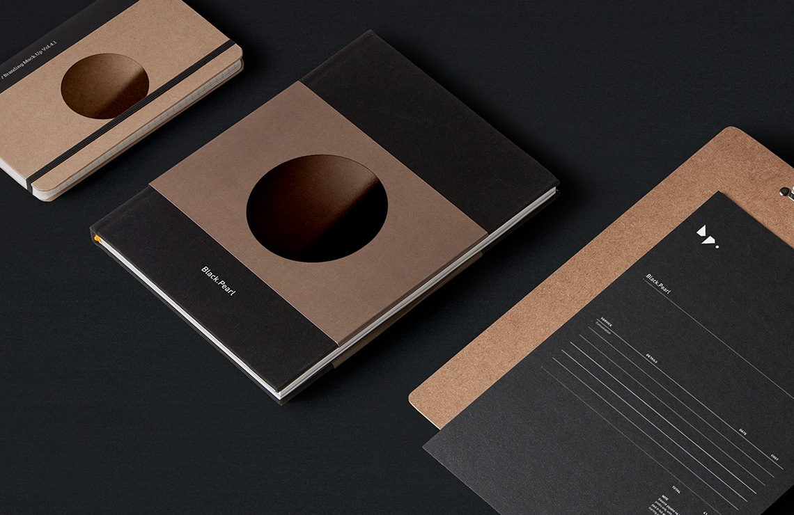
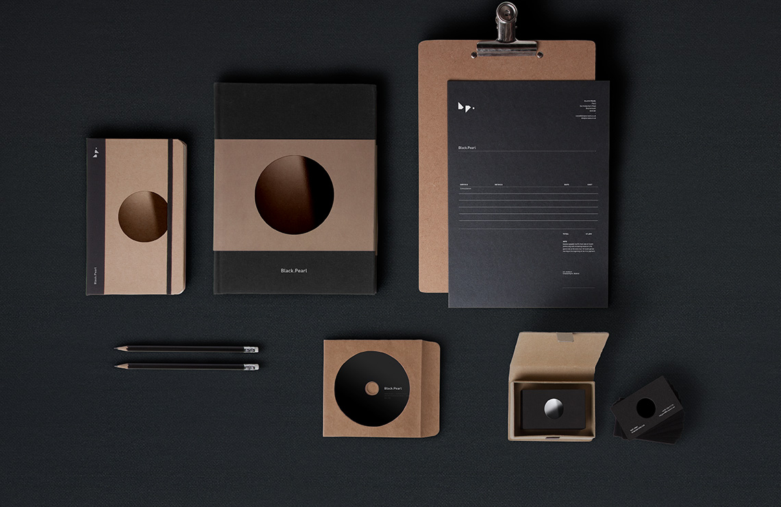
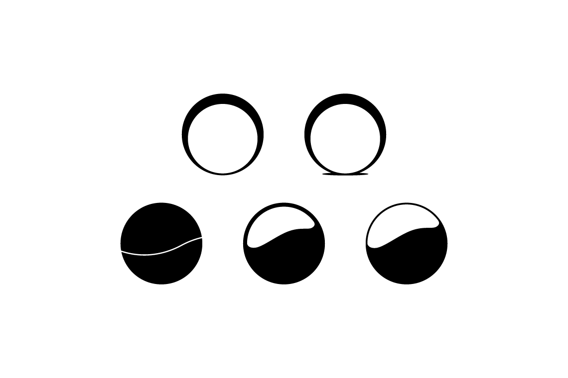
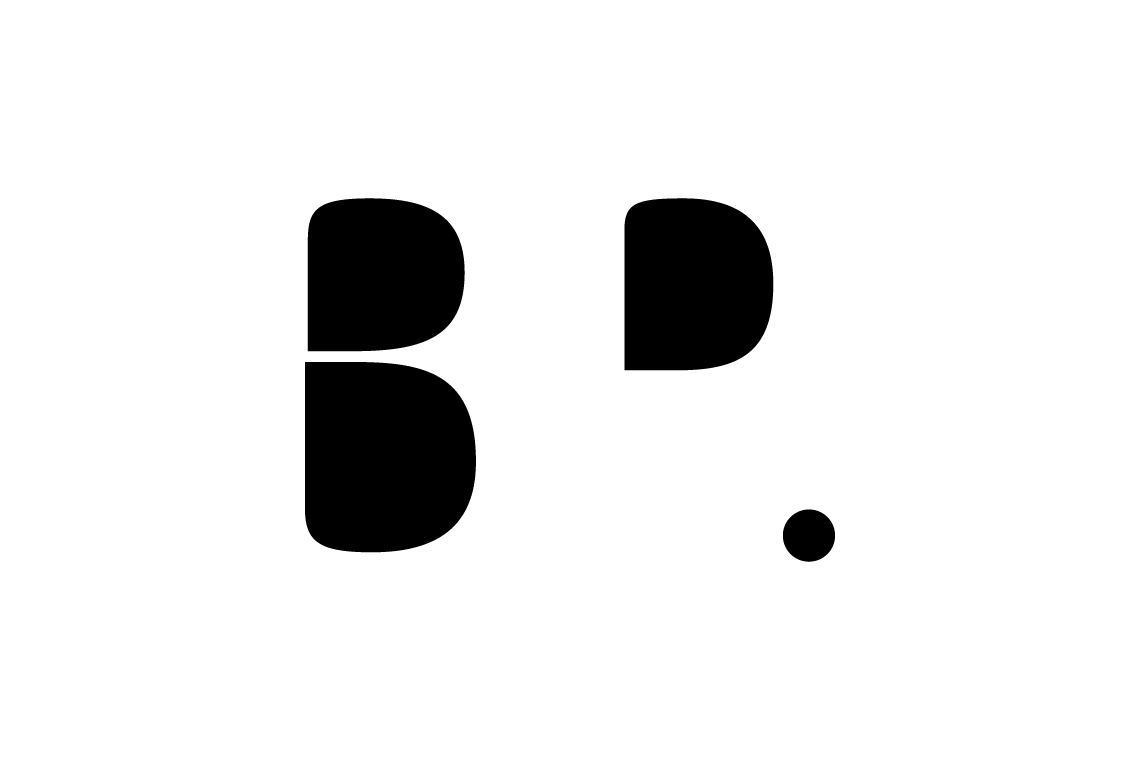
Black Pearl
Russian Architectural Firm
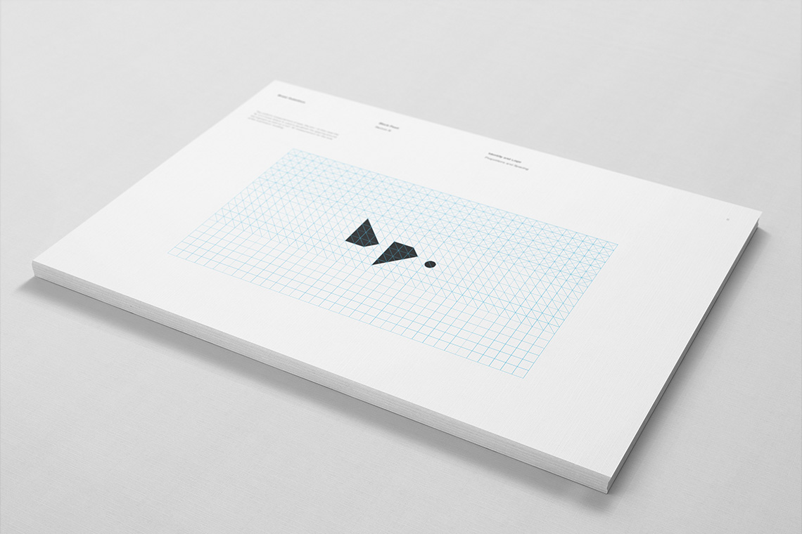
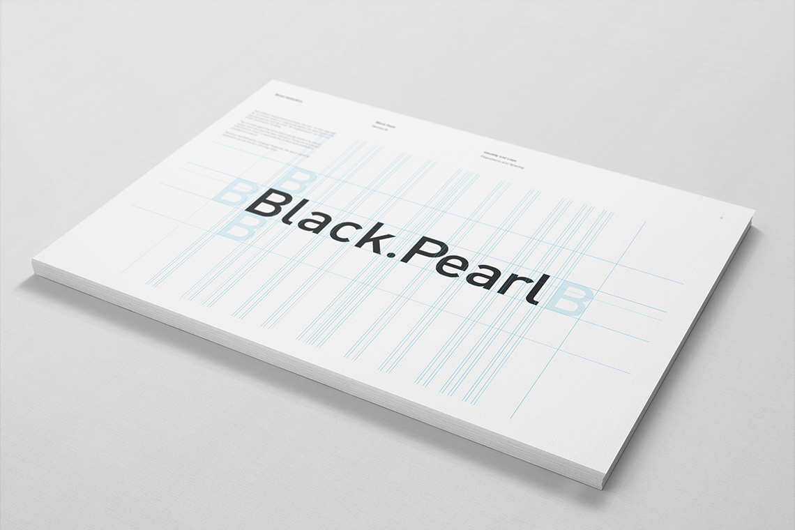
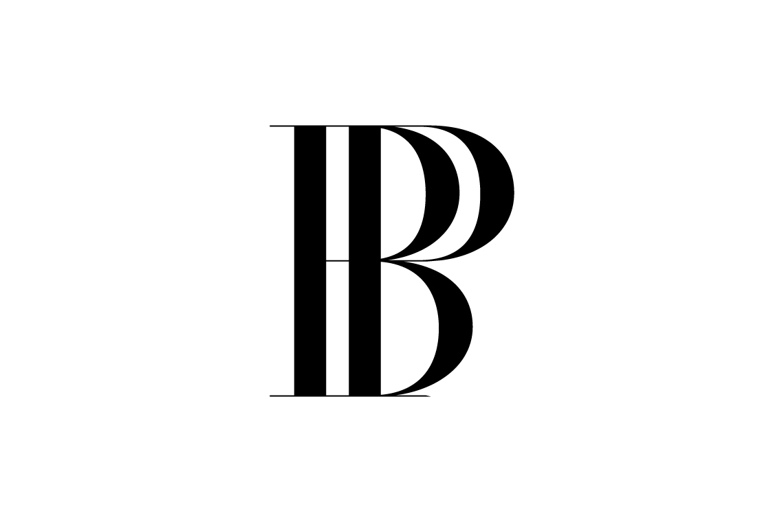
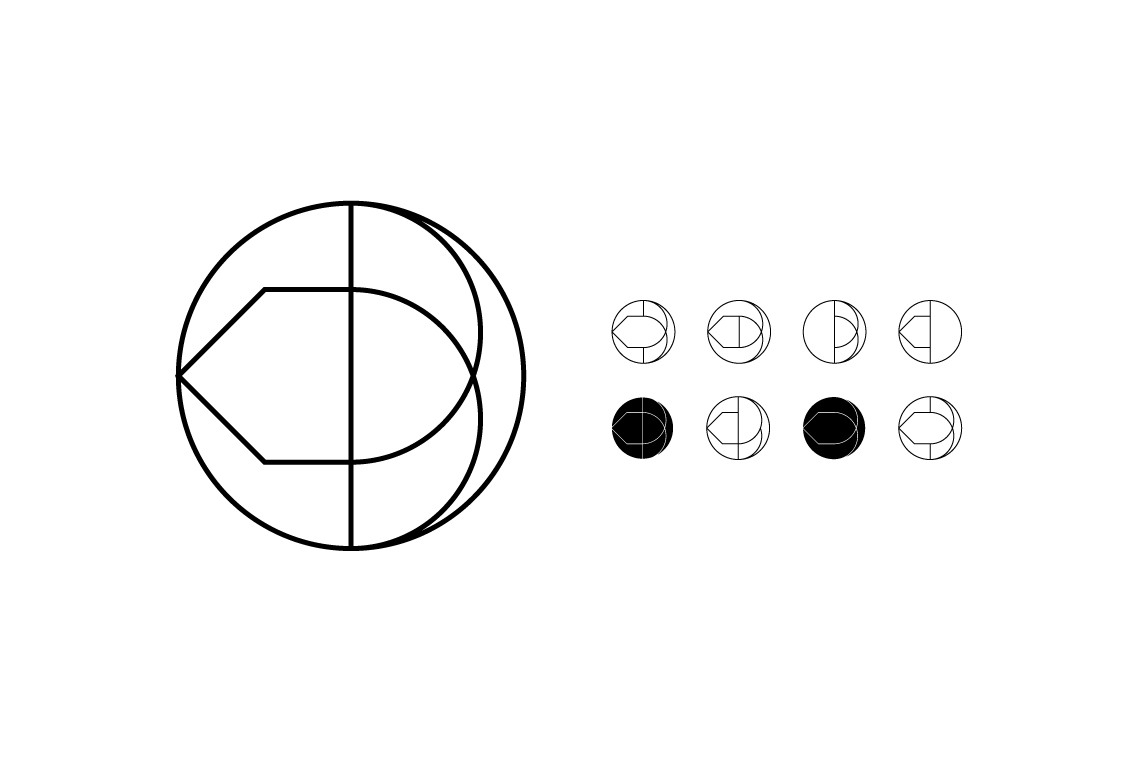
After multiple plays with creating a monogram, the answer came through a grid found on the architects drawing pad. Sharing both similar and opposing forms, the lower case initials created a wonderfully simple and structured form. Though the final form seems quite clear now, it didn't arrive without much exploration.
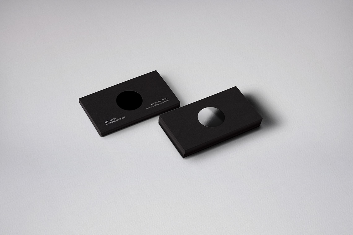
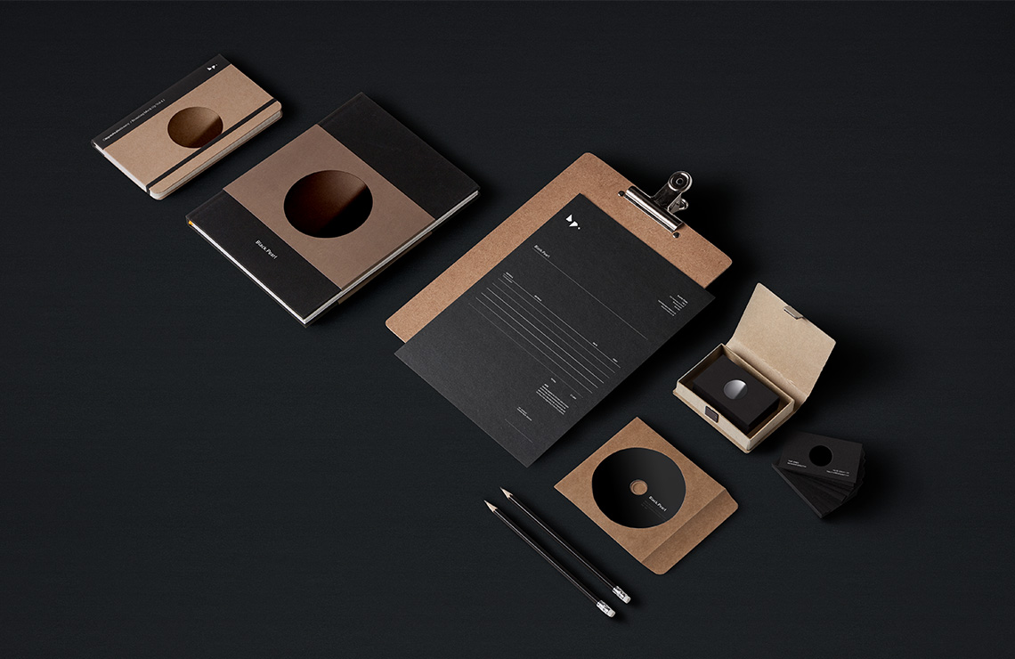
A black circle may not be the most creative idea for a company called Black Pearl, but I wanted to keep a trace of it around in the monogram. By exploring the print possibilities, be it thermo-graphic, pearlescent, foil, we could elevate a simple circle to something quite distinct and evocative of the name.
From the sketchbook:

Made in Scotland
Bred in Wales, educated in Cornwall and working in England. Living among the cafés, coffee shops and clichés of Christchurch. Plumen light bulbs dangle in pendants above the dining room table, Bertoia diamond chairs are draped in fur throws and a rosewood Eames lounger is home to an owl shaped cushion with button eyes. I’ve operated under the guise of a designer since 2008, dabbling in the ink, pixels and vectors of brand and building between the parentheses of web development.
For those of you who prefer picture books and colouring outside the lines.
Download Something Sensible [PDF]
For the more discerning connoisseur who can spell connoisseur without a google search.
